Ensembly User Guide
Everything you need to manage your Ensembly website with confidence — from editing pages to adding new content.

Logging In
Go to your login url and sign in with the username and password Cyan Solutions provided separately.
Once logged in, you'll land on the WordPress Dashboard. The menu down the left side is how you get everywhere else:
Pages — the main site pages (Home, About, Contact, etc.)
Posts — news/blog articles
Sermons, Services, Staff — the church-specific content types covered below
Media — your uploaded images, PDFs, and audio files
Site Options (near the bottom) — site-wide settings like the logo and footer
If you ever forget your password, use the "Lost your password?" link on the login screen.
Site Options
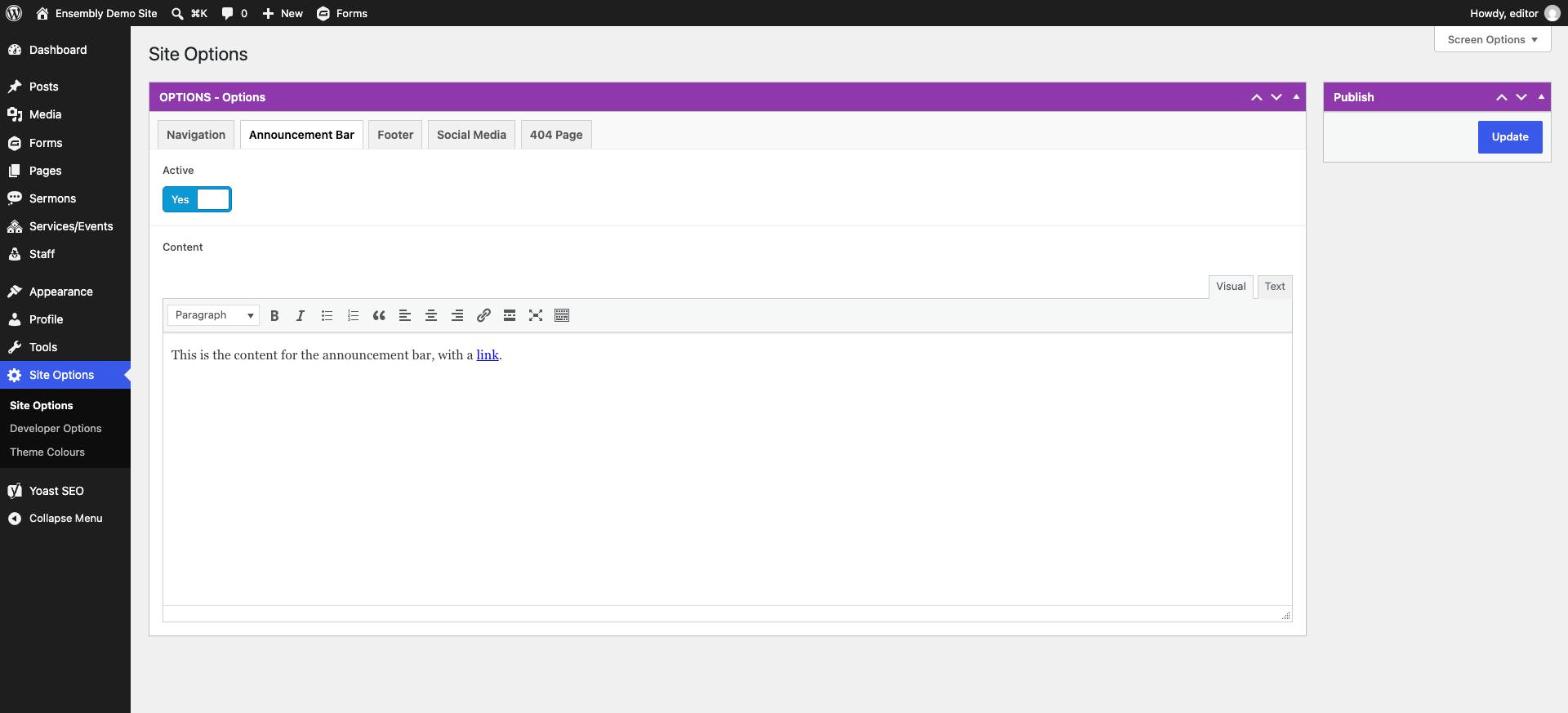
These live under Options near the bottom of the left menu and apply across the whole site, not just one page.
| Tab | What you can change |
|---|---|
| Navigation | The site logo, and a "link to store" button if used |
| Announcement Bar | Turn the top announcement bar on/off and edit its message |
| Footer | Footer colour mode, footer logo, three footer text columns, and the newsletter sign-up block (title, text, button) |
| Social Media | The list of social icons and their links — add/remove accounts here |
| 404 Page | The heading and message shown when a visitor hits a broken link |
Adding a New Page
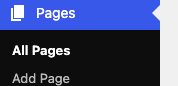
Pages → Add New in the left menu.
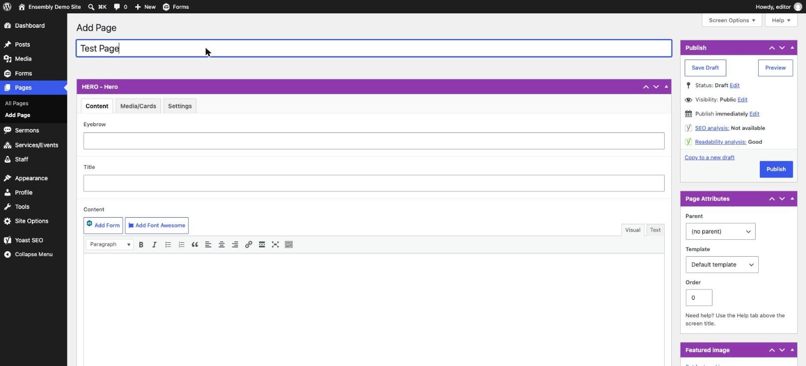
Type a Title at the top — this becomes the page's heading and web address.

This theme builds every page out of the Hero section and Page Builder blocks (see below) instead of free-form text, so all your content goes into those.
Scroll down to fill in the Hero, then click Add Component to start stacking Page Builder blocks.
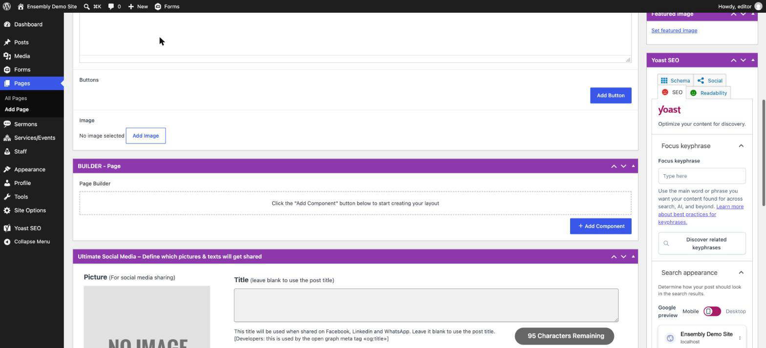
Components can be move up or down on the page by clicking the component and dragging it to the new location.
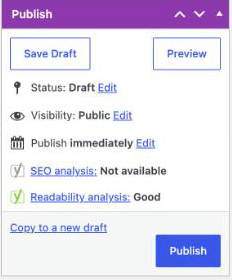
Click Save Draft to save your progress without making the page live, or Preview to see how it looks before publishing.
Click Publish (top right) to make the page live.

A new page does not automatically appear in the site's navigation — see Editing the Menu, below, to add it there.
Editing an Existing Page
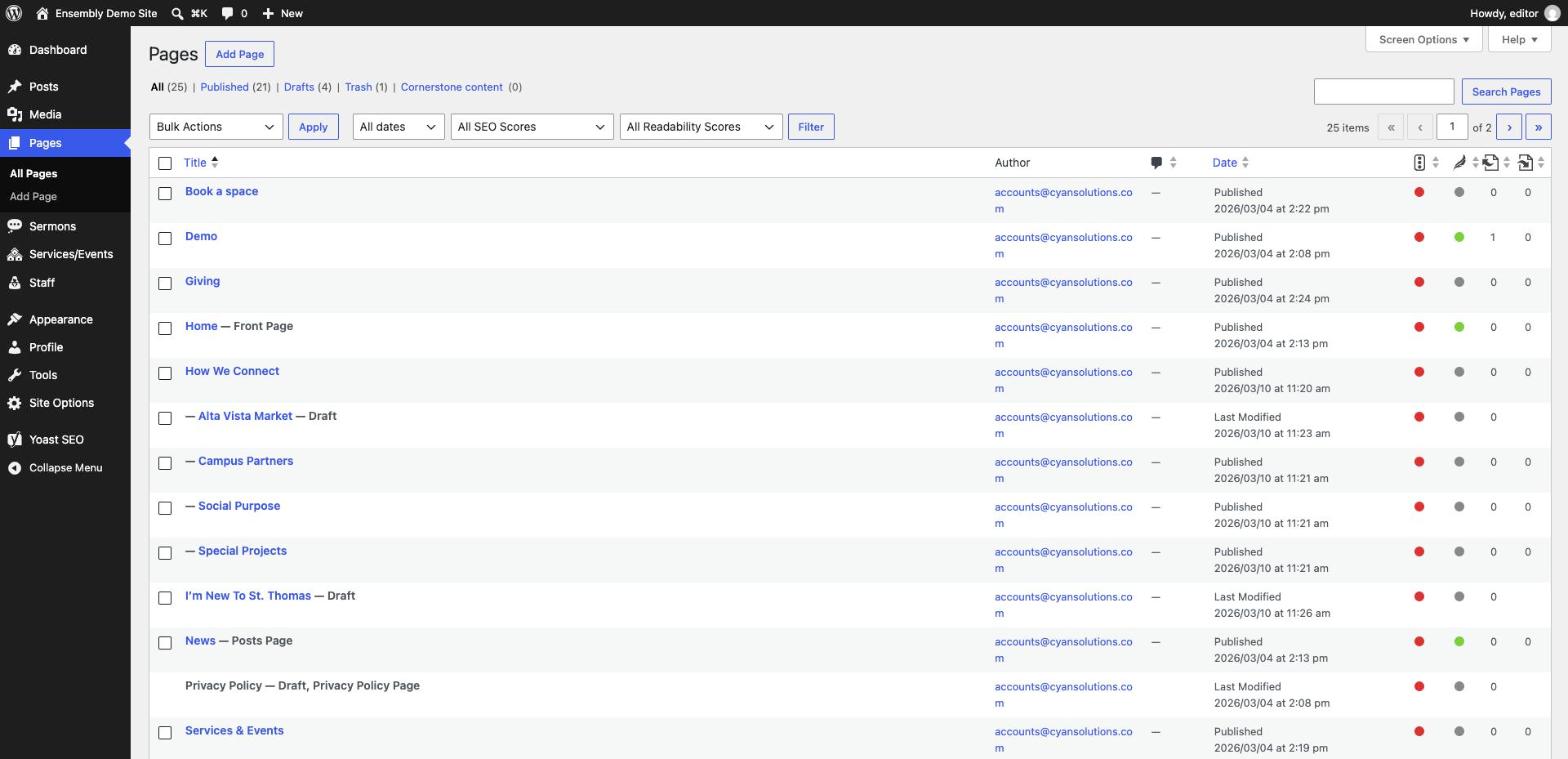
In the left menu, click Pages, find the page you want, and click its title to open it.
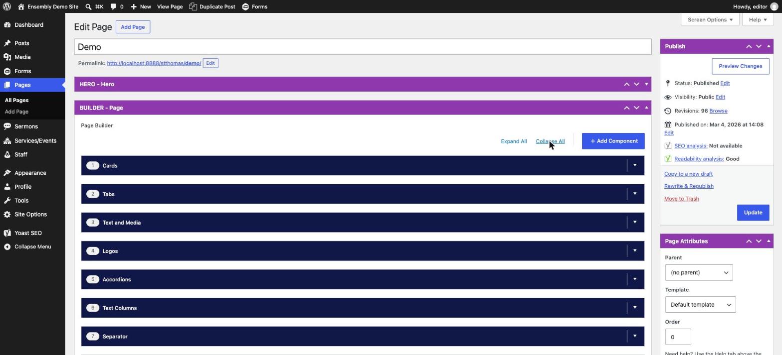
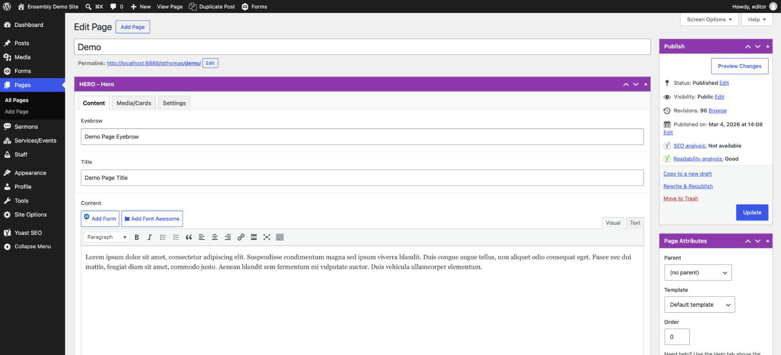
Most pages start with a Hero section at the top — the large banner with a heading, optional background image or colour, and buttons. Scroll to the top of the editor to find its fields.
Below the Hero is the Page Builder — a stack of content blocks (see the next section for what each one does). Click any block to expand it and edit its fields.
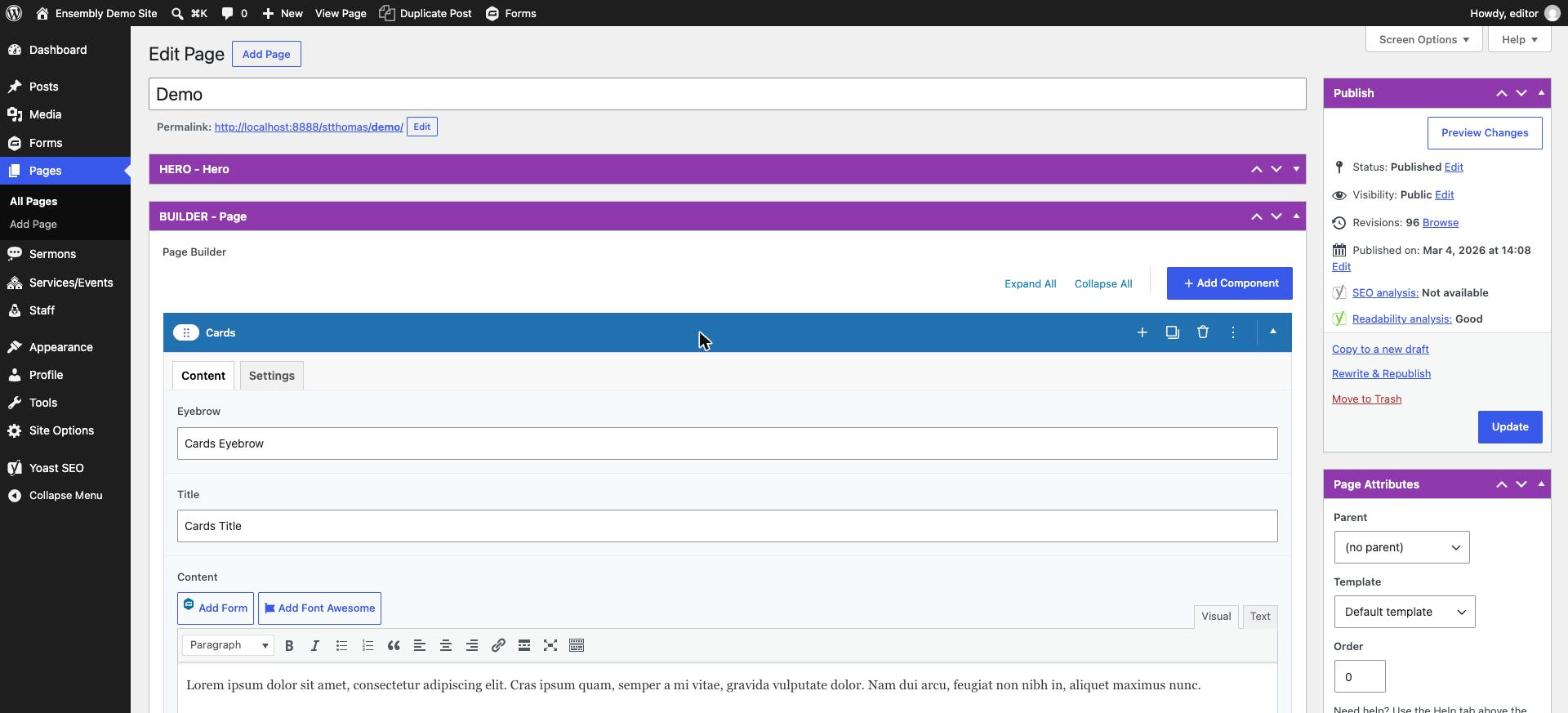
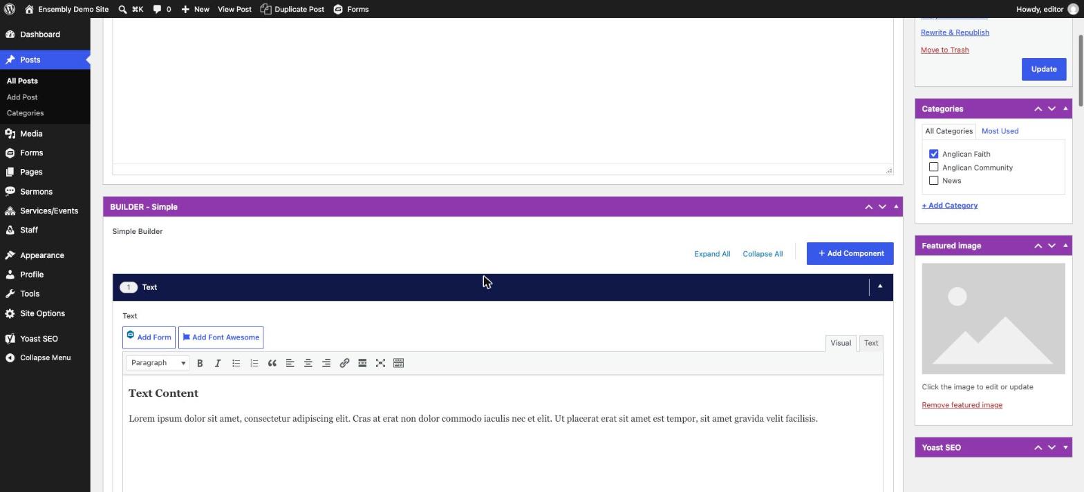
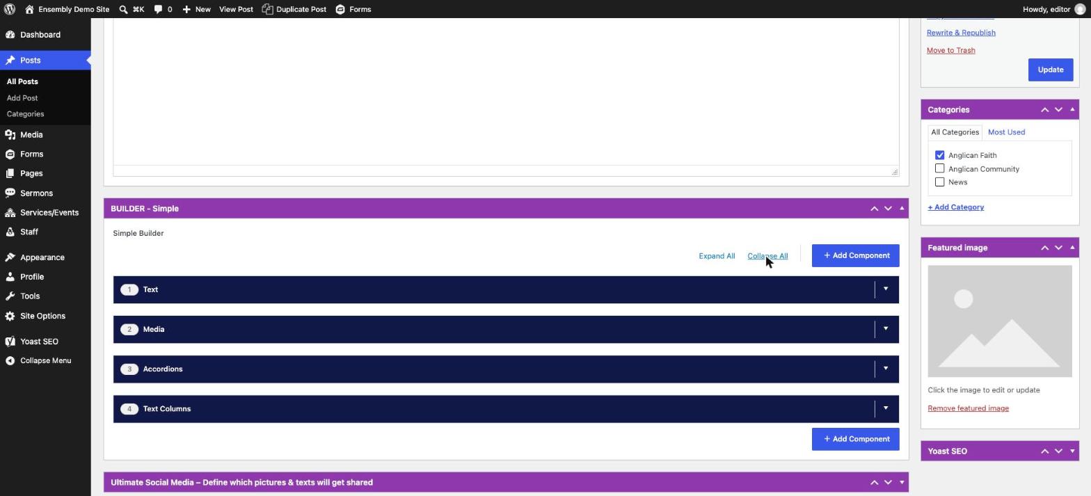
Click a block's header (the coloured bar with its name) to toggle it open or closed. You can also use Expand All / Collapse All above the block stack to do this for every block at once.

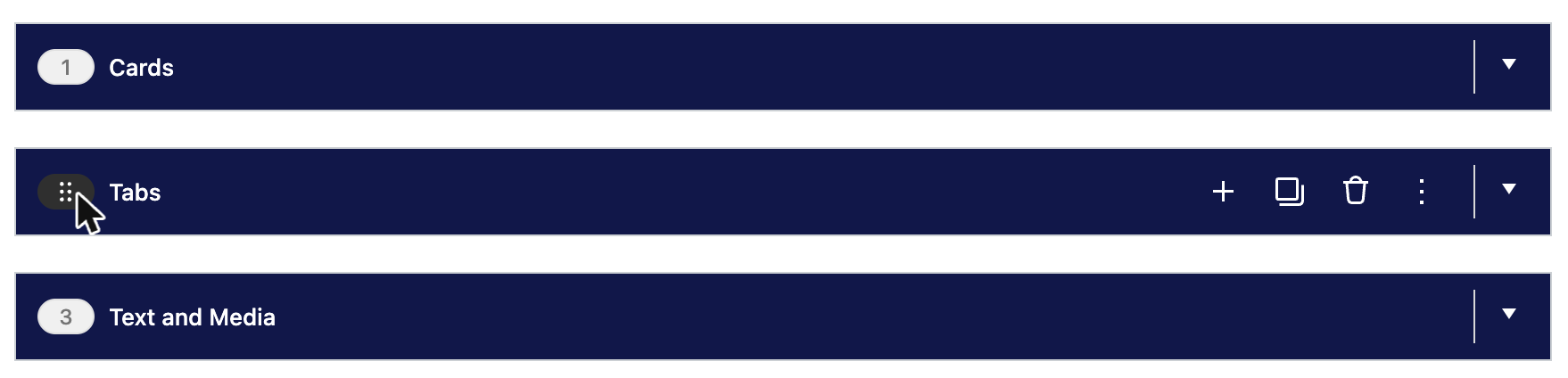
To reorder blocks, drag them by the small handle on the block's header. To add a new one, scroll to the bottom of the stack and click Add Component.
Tip: closing all the components first makes them much easier to reorder, since you're dragging short bars instead of long expanded blocks.
When you're done, click Update (top right) to publish your changes live. There's no separate draft/preview step for small edits — Update makes the change visible immediately.

If you're not sure a change looks right, open the live page in another browser tab after updating to check it.
Hero Banner
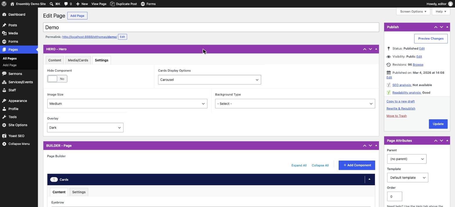
The Hero is the large banner at the top of every page — it has its own three tabs, separate from the Page Builder below it:
Content — Eyebrow, Title, Content, and Buttons (one or more call-to-action links).
Media/Cards — choose what shows alongside the text: a set of Cards, added manually or auto-pulled from News, Sermons, or Services by category.
Settings — Hide Component to turn the Hero off entirely, Cards Display Options (e.g. Carousel), Image Size, Background Type (image or colour) with its own colour/overlay controls once selected.
Page Builder
Every page is built by stacking these blocks. Add one from Add Component on any page, then pick its type.
| Block | What it shows | Use it for | Key fields |
|---|---|---|---|
| Cards | A grid of cards, added manually or auto-pulled from News, Sermons, or Services by category | Featured links, programs, or "latest posts" grids | Eyebrow, Title, Content; manual cards or auto-pulled by category; each card: image/icon, title, content, link; image size, column count |
| Text and Media | Text beside an image | General content with a supporting photo | Eyebrow, Title, Content, Buttons; image or video; left/right layout, captions, background colour |
| Text Columns | Text split across 2+ columns | Longer text that benefits from a multi-column layout | Per column: icon, content, buttons; number of columns, background/text colour |
| Accordions | Expandable, click-to-open sections | FAQs, policies, anything with many short topics | Eyebrow, Title, Content; each item: a label and its content |
| Tabs | Content organized into clickable tabs | Grouping related info without a long scroll | Intro content; each tab: a label plus its own mini content (text columns, media, a card, or accordions) |
| CTA | A banner with a heading and button | Driving traffic to a specific page (donate, register, contact) | Icon, Eyebrow, Title, Content, Buttons, Image; layout, captions, background/text colour |
| Form | An embedded form | Contact forms, sign-ups, registrations | Eyebrow, Title, Content, Buttons; choice of a Gravity Form or an embed code |
| News Feed | Auto-pulled recent news posts | Keeping a page's news section current without manual updates | Feed type, Title, Buttons |
| Staff | Staff member cards, pulled from the Staff directory | Team/clergy listings on a page | Eyebrow, Title, Content, Buttons; pull by category or hand-pick individuals |
| Logos | A row of logos | Partner, sponsor, or affiliate logos | Eyebrow, Title, Content; each logo: an image and a link; logo size |
| Progress Bar | A visual progress bar | Fundraising goals or campaign progress | Eyebrow, Title, Content, Buttons; percent complete, a message; bar/background/text colour |
| Media | A standalone image, video, or embed | Standalone visuals that don't need surrounding text | Image or video items; captions on/off |
| Separator | A horizontal divider line | Visually breaking up two sections | Just an on/off toggle to add the divider |
Components can be dragged up or down to change their position on the page. Click on the component and drag it to its new location.
Note: Posts (News) and Sermons use a shorter Simple Builder with only Text, Media, Accordions, and Text Columns — the full block list above is for Pages only.
Cards
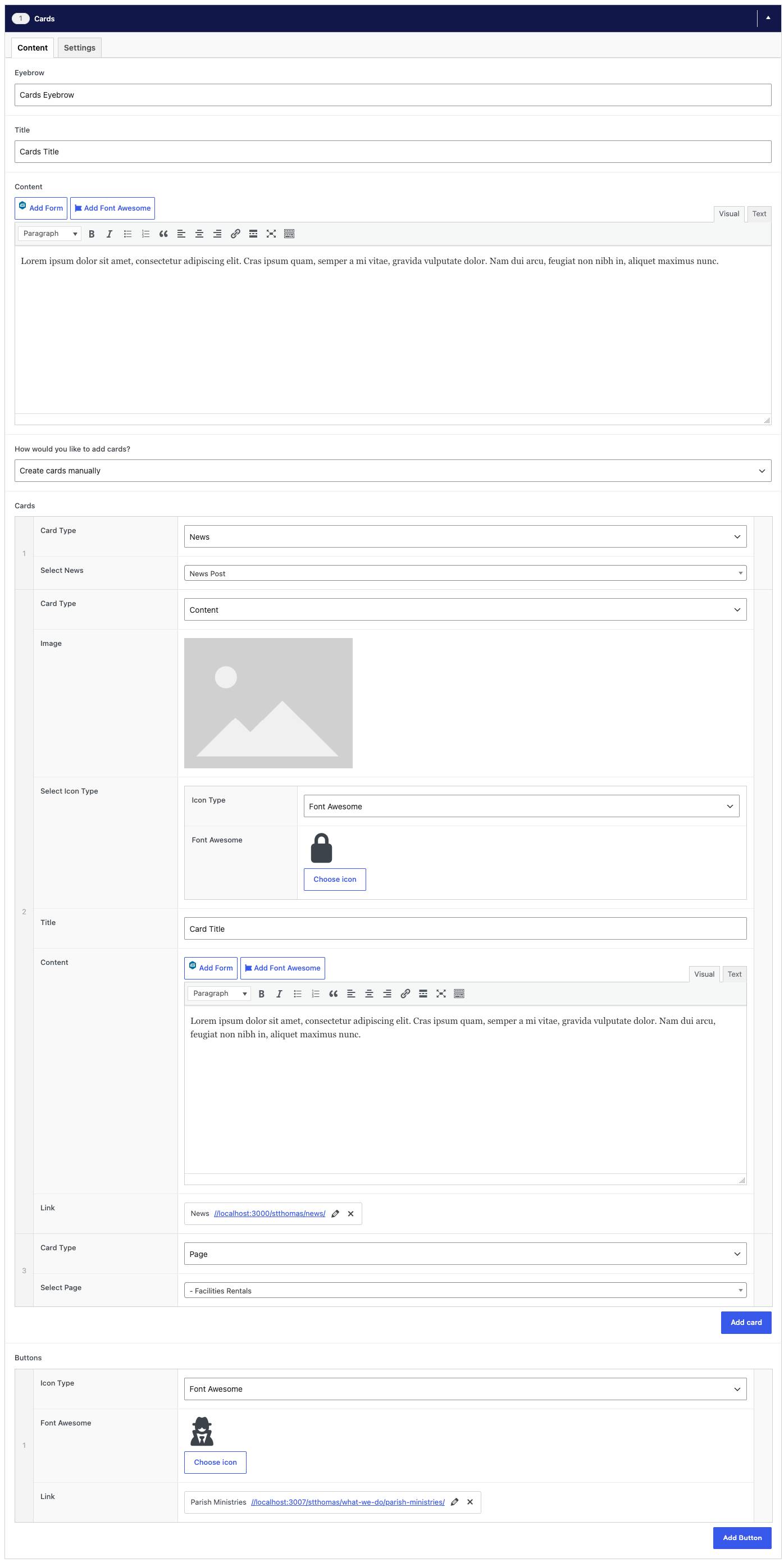
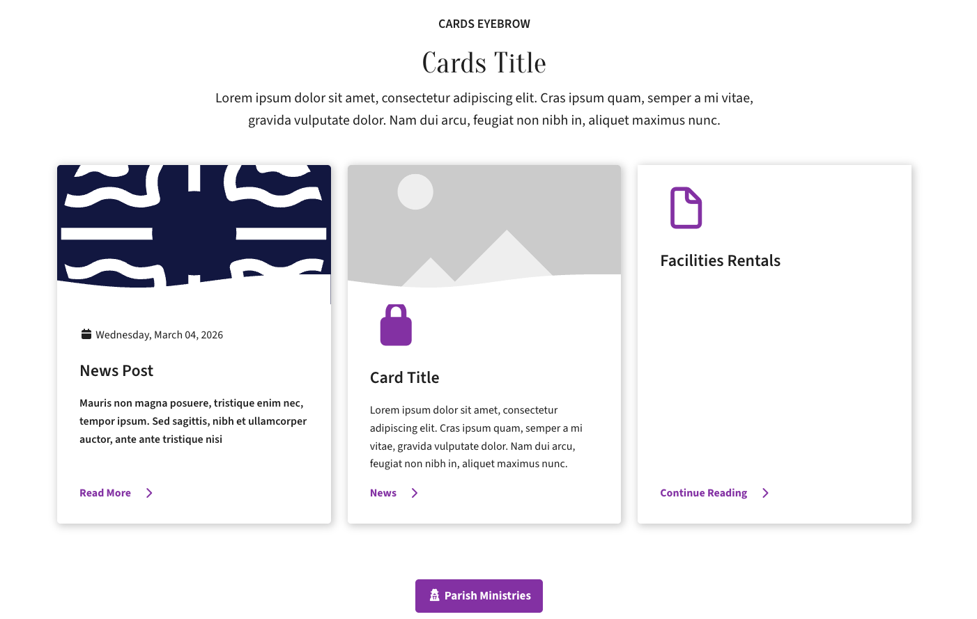
Shows a grid of cards, each with an image or icon, a title, a short description and a link. Best for pointing visitors to other pages, like programs, ministries or ways to get involved. It can also fill itself automatically with the latest News, Sermons or Services from a category you choose.
Content tab
- Eyebrow, Title, Content — optional heading and intro text above the component. The eyebrow is the small line of text above the title.
- How would you like to add cards? — Create cards manually to build each card yourself, or Automatic feed to fill the cards with your latest News, Sermons or Services/Events.
- Automatic feed options — choose how many cards to show, which type of content, and optionally a category to limit it to.
- Cards (manual only) — click Add card for each one and pick a Card Type. Content lets you enter the image or icon, title, text and link yourself. The other types (Page, News, Sermon, Event, Service, Staff) let you pick an existing item and fill the card from it.
- Buttons — optional. Click Add Button, then set the link (where it goes and the button text) and an optional icon.
Settings tab
- Hide Component — hides this component from the page without deleting it.
- Image Size — the height of the card images: Short, Medium or Tall.
- Number of Columns — how many cards sit side by side (1–3).

Text and Media
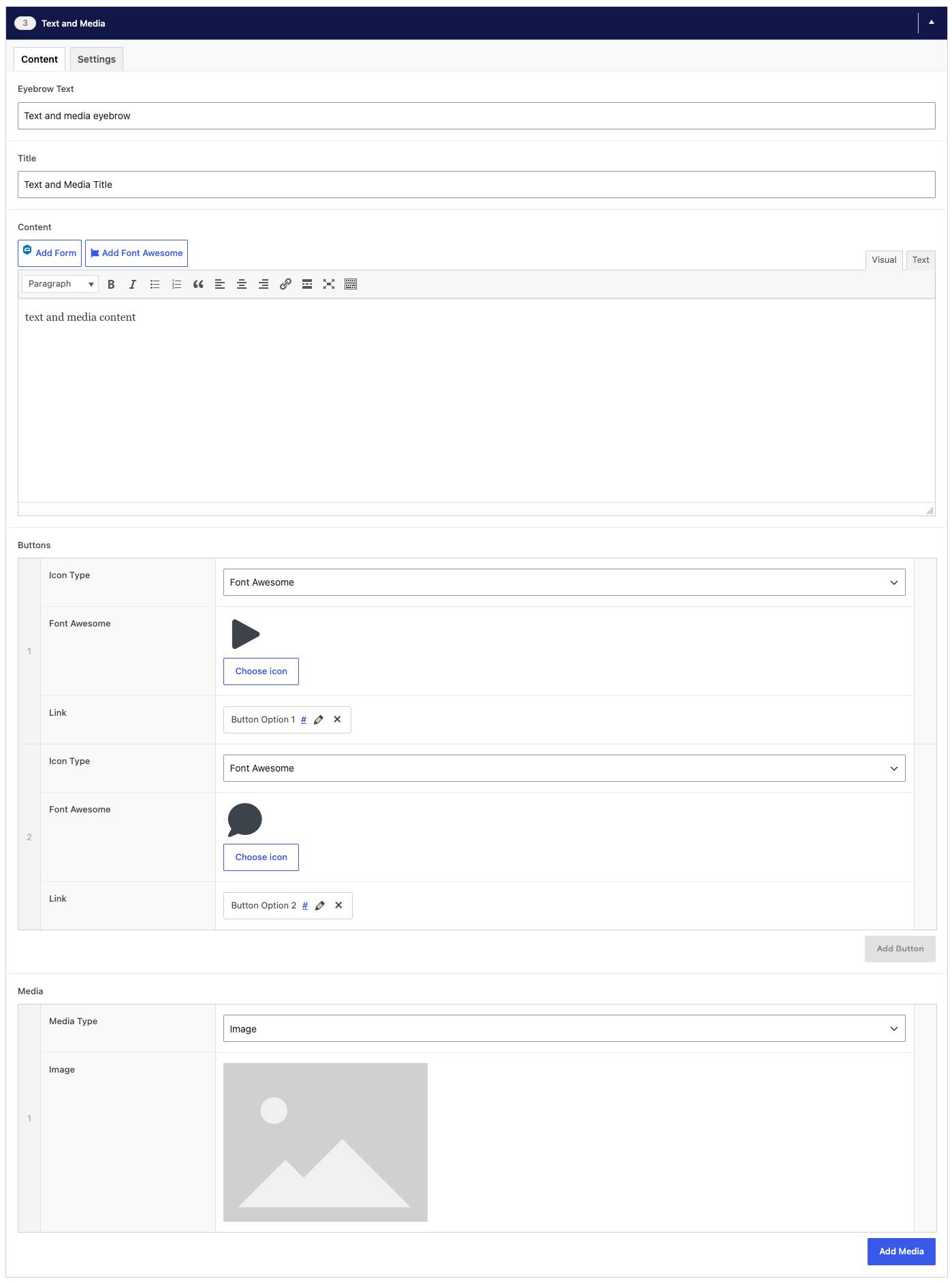
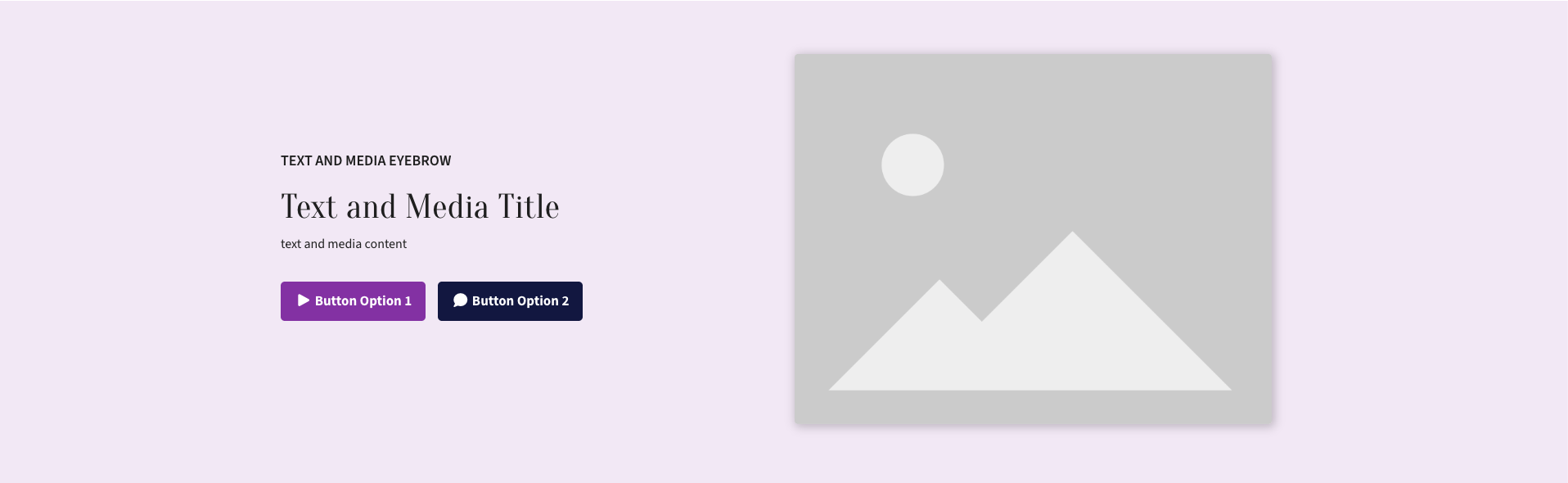
Places text beside an image or video. Best for general content that benefits from a supporting photo, such as an introduction to the church, a program or an upcoming event.
Content tab
- Eyebrow Text, Title, Content — the text that sits beside the image or video.
- Buttons — optional. Click Add Button, then set the link (where it goes and the button text) and an optional icon.
- Media — add an Image, or a Video by pasting its YouTube or Vimeo link. Add more than one to make a slider.
Settings tab
- Hide Component — hides this component from the page without deleting it.
- Layout — put the text on the left or right. The media goes on the other side.
- Show captions — shows each image's caption underneath it. Captions are added to the image in the Media Library.
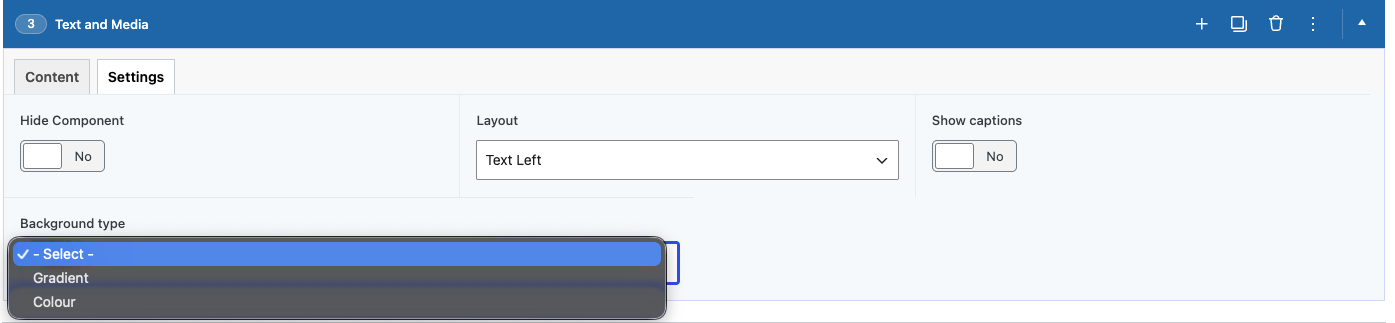
- Background type — Gradient for the theme's default background, or Colour to choose your own below.
- Background colour — leave empty for the default, or pick a colour.
- Text Colour — choose Light for dark backgrounds and Dark for light ones. Only applies when a background colour is set.
Text Columns
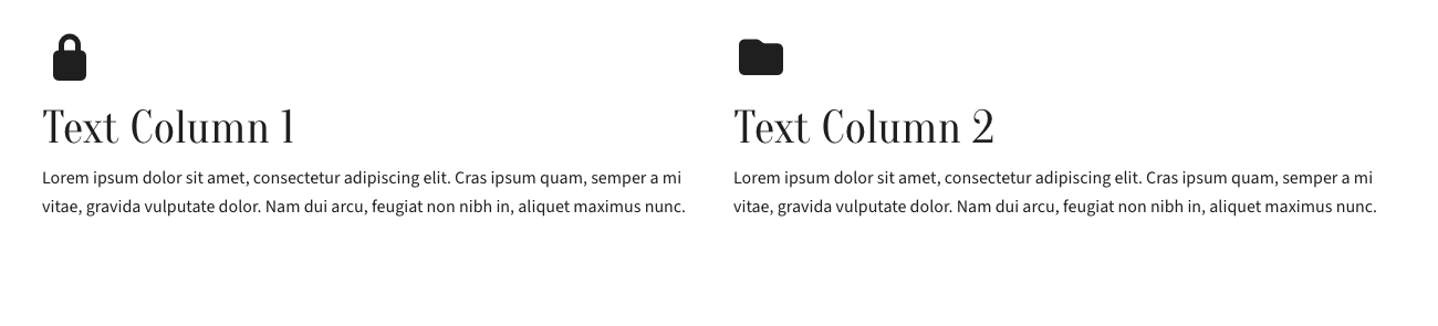
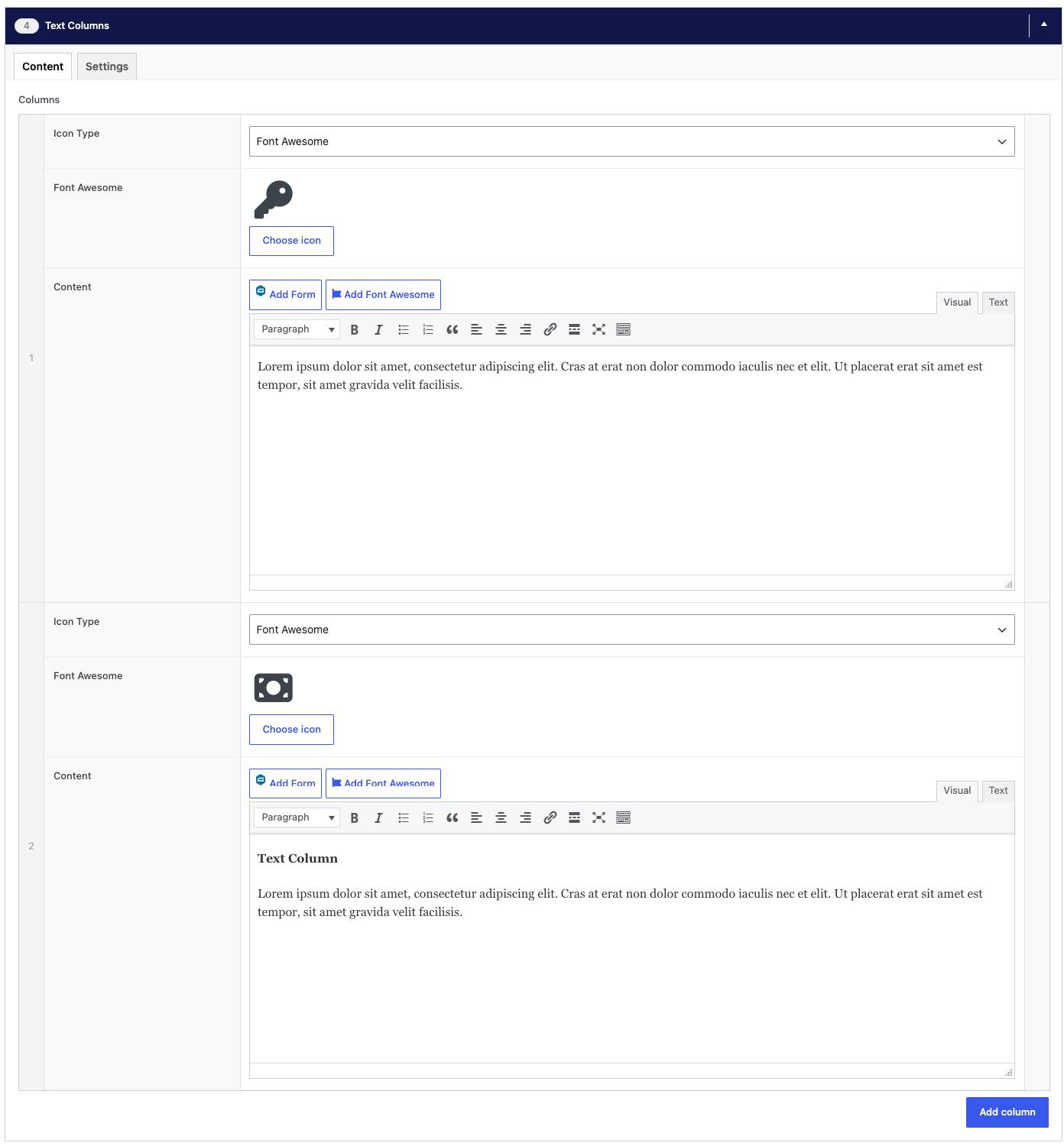
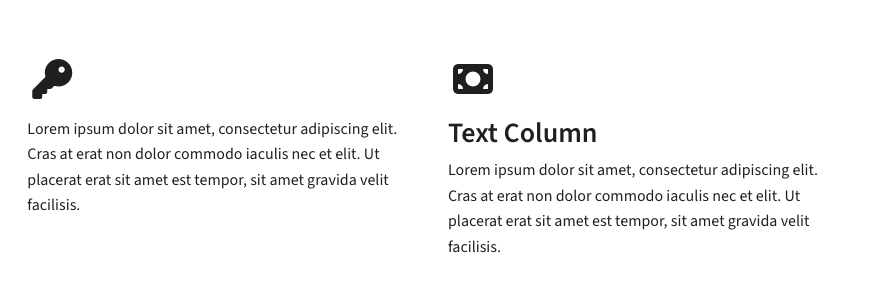
Splits text across two or more side-by-side columns, each with an optional icon and buttons. Best for longer content that reads more easily in columns, or for presenting a few related points next to each other.
Content tab
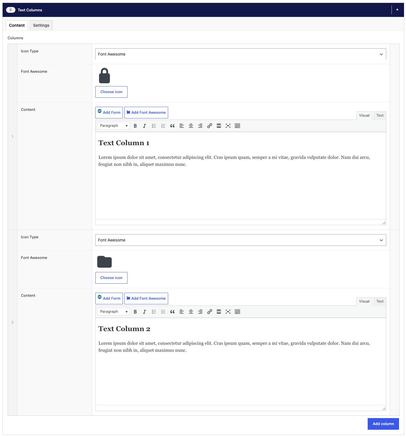
- Columns — click Add column for each column. Each has an optional icon (pick one from the icon library, or upload your own image) and its own content, which can include buttons and links.
Settings tab
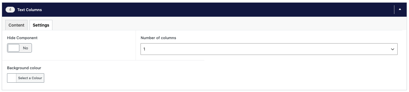
- Hide Component — hides this component from the page without deleting it.
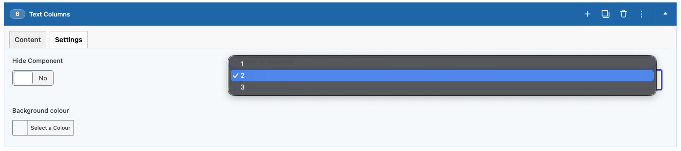
- Number of columns — how many columns sit side by side (1–3). Extra columns wrap onto a new row.
- Background colour — leave empty for the default, or pick a colour.
- Text Colour — choose Light for dark backgrounds and Dark for light ones. Only applies when a background colour is set.
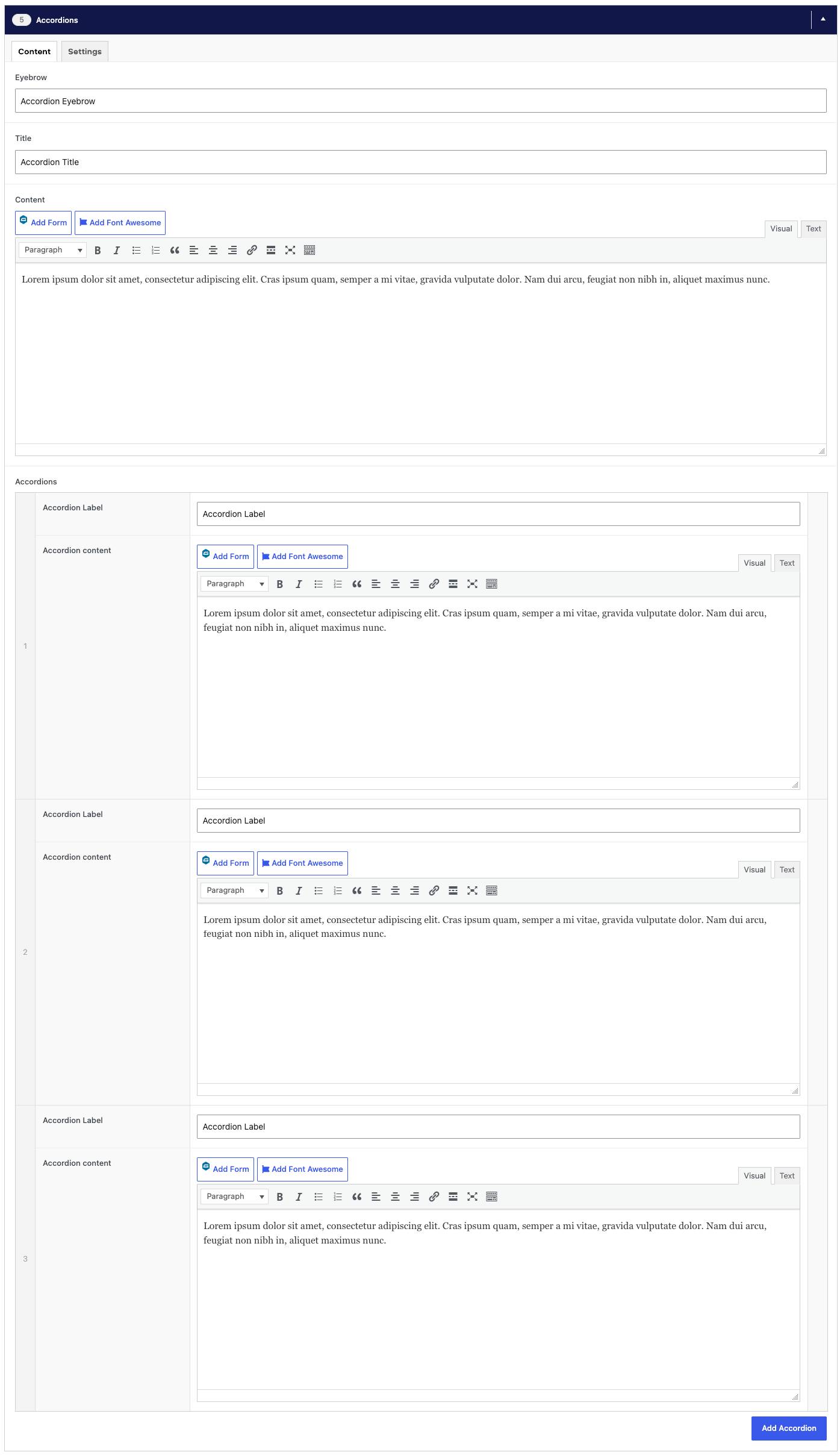
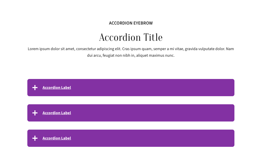
Accordions
A list of headings that each open to reveal their content when clicked. Best for FAQs, policies or any page with many short topics, so visitors can jump to what they need without a long scroll.
Content tab
- Eyebrow, Title, Content — optional heading and intro text above the component. The eyebrow is the small line of text above the title.
- Accordions — click Add Accordion for each item. The Accordion Label is the heading visitors click, and the Accordion content is what opens up below it.
Settings tab
- Hide Component — hides this component from the page without deleting it.

Tabs
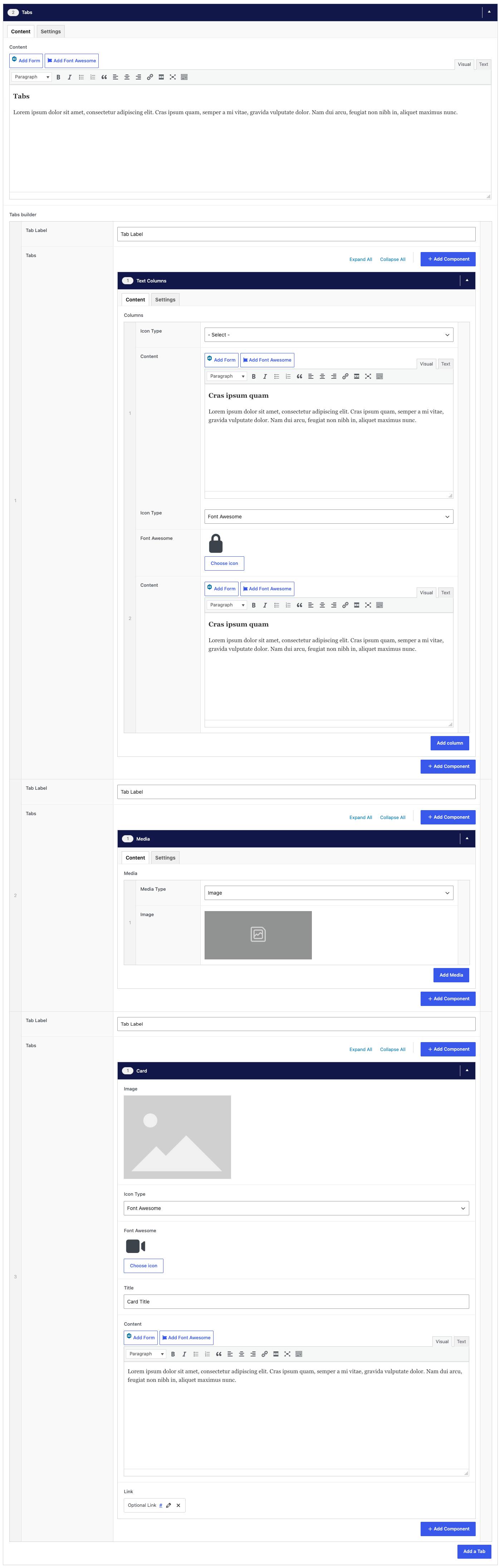
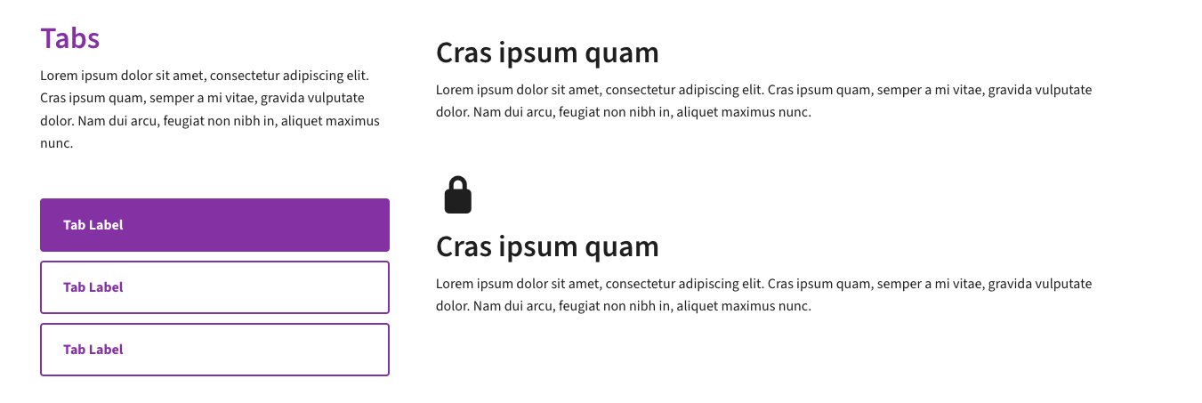
Organizes content into clickable tabs, with only one tab showing at a time. Best for grouping related information in one place, such as worship times by location or details for different age groups.
Content tab
- Content — optional intro text above the tabs.
- Tabs builder — click Add a Tab for each tab. Give it a Tab Label (the text on the tab), then add what goes inside: Text Columns, Media, a Card or Accordions. Each works like the component of the same name.
Settings tab
- Hide Component — hides this component from the page without deleting it.

CTA
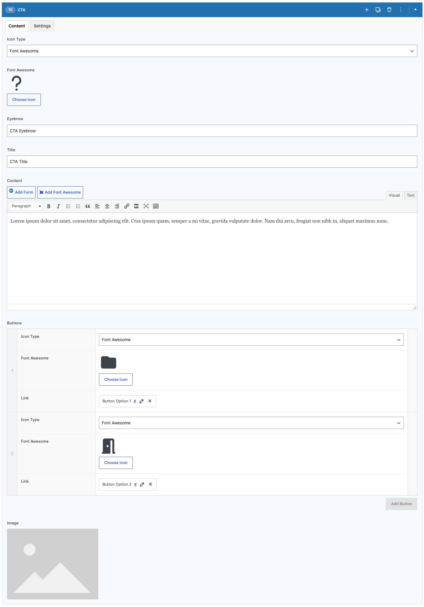
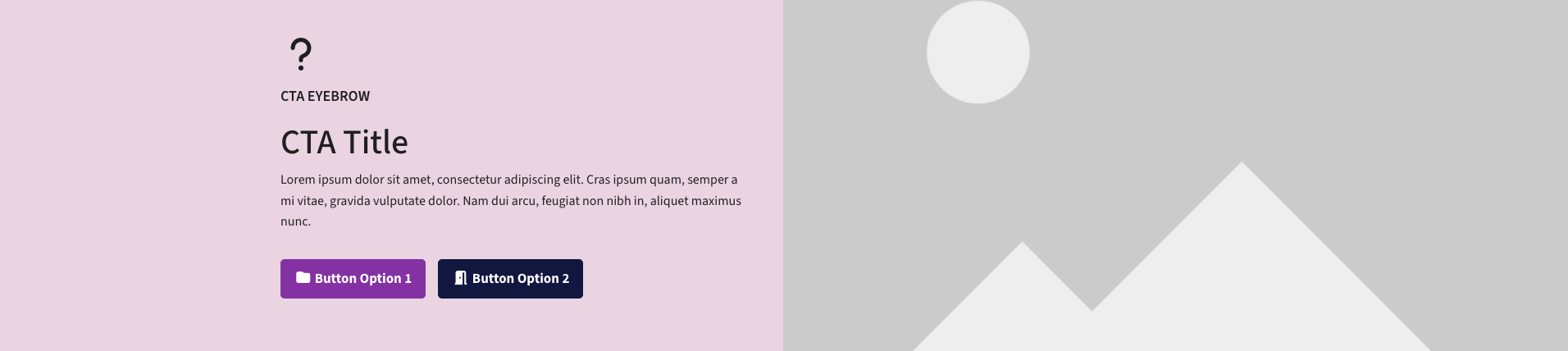
A call-to-action banner with a heading, short text and a button. Best for driving visitors to one specific next step, like donating, registering for an event or getting in touch.
Content tab
- Icon Type — an optional icon (pick one from the icon library, or upload your own image) above the heading.
- Eyebrow, Title, Content — keep it short: one clear message.
- Buttons — the action you want visitors to take, e.g. Donate or Register. Click Add Button and set the link.
- Image — an optional photo beside the text.
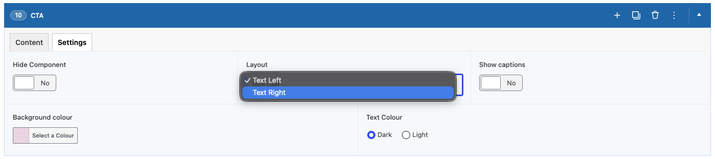
Settings tab
- Hide Component — hides this component from the page without deleting it.
- Layout — put the text on the left or right. The image goes on the other side.
- Show captions — shows each image's caption underneath it. Captions are added to the image in the Media Library.
- Background colour — leave empty for the default, or pick a colour.
- Text Colour — choose Light for dark backgrounds and Dark for light ones. Only applies when a background colour is set.
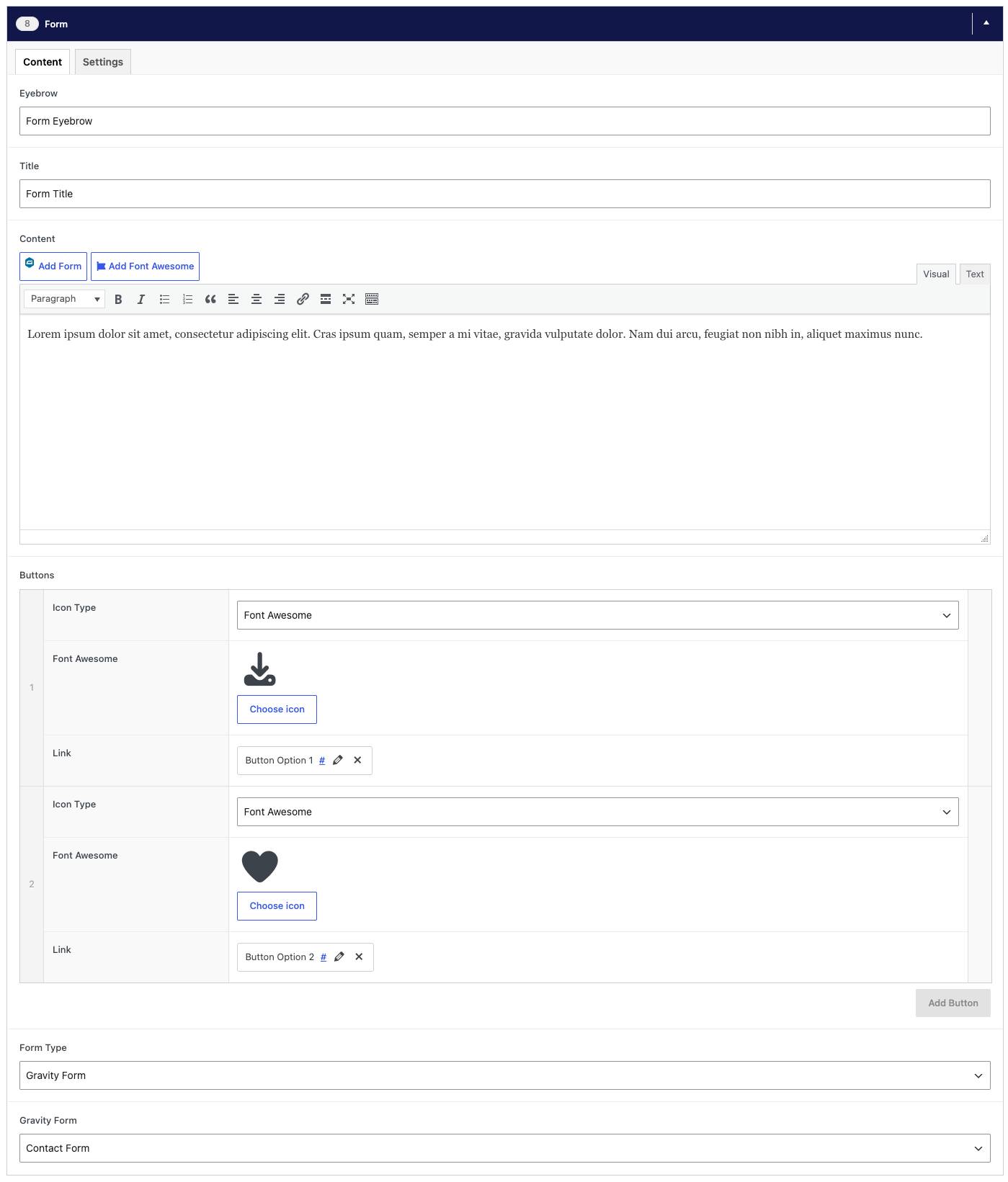
Form
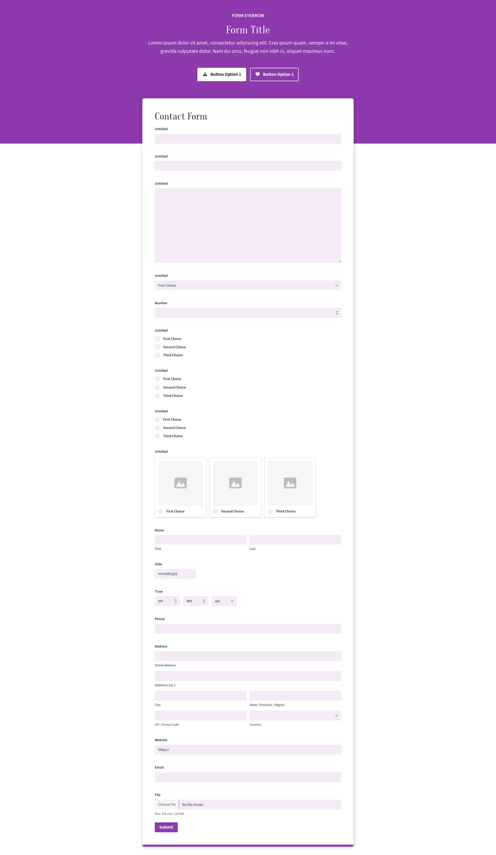
Embeds a form on the page, with optional heading and text above it. Best for contact forms, sign-ups and registrations.
Content tab
- Eyebrow, Title, Content — optional heading and intro text above the component. The eyebrow is the small line of text above the title.
- Buttons — optional. Click Add Button, then set the link (where it goes and the button text) and an optional icon.
- Form Type — Gravity Form to use a form built on this site (see Forms), or Embed to use a form from another service.
- Gravity Form / Embed form — pick the form from the list, or paste the embed code you were given by the other service.
Settings tab
- Hide Component — hides this component from the page without deleting it.

News Feed
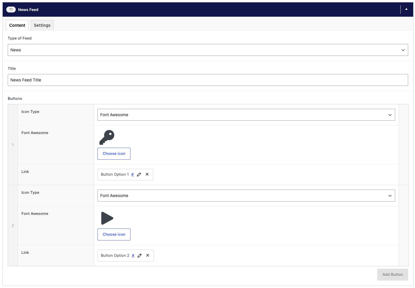
Automatically shows your most recent news posts. Best for keeping a page's news section current without having to update it by hand.
Content tab
- Type of Feed — show your latest News posts or upcoming Events. The list updates itself as you publish.
- Title — the heading above the feed.
- Buttons — optional, e.g. a "View all news" link.
Settings tab
- Hide Component — hides this component from the page without deleting it.


Staff
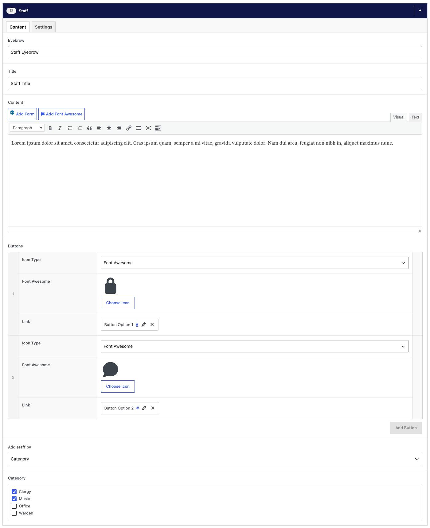
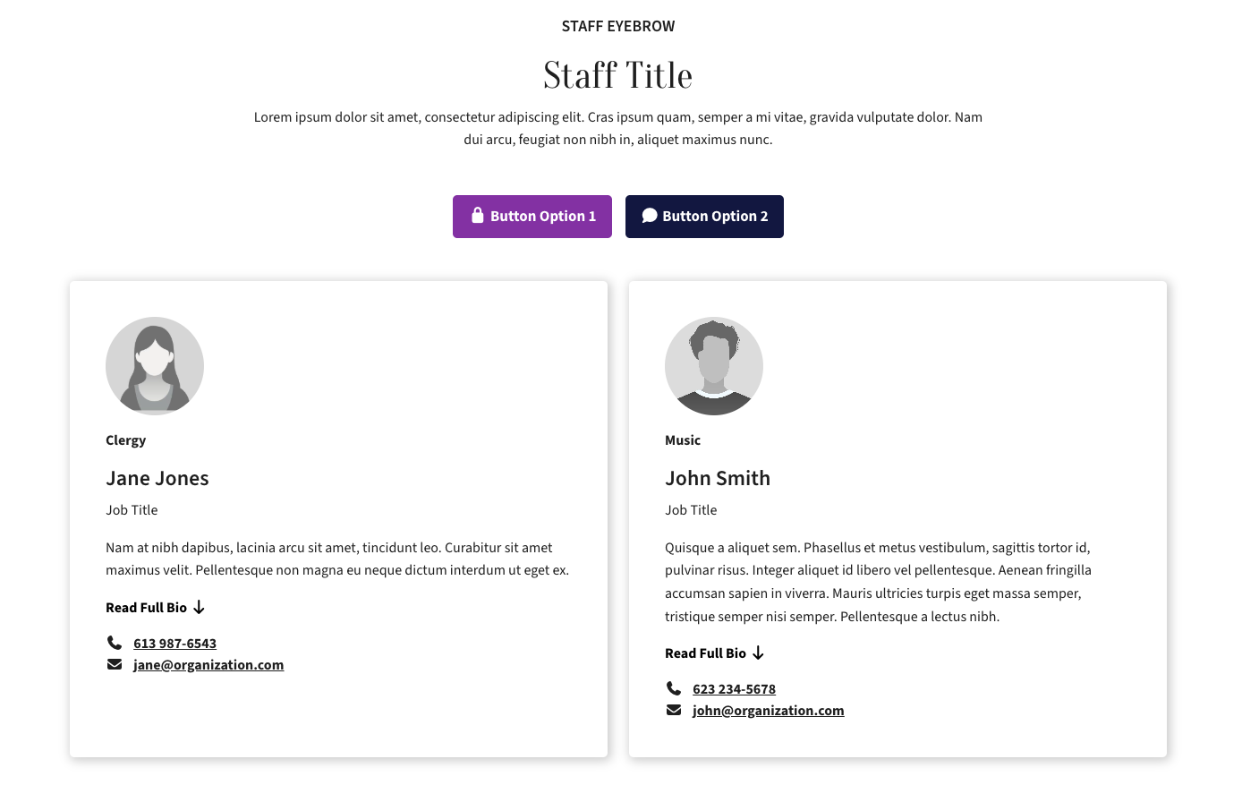
Shows staff member cards pulled from the Staff directory. Best for clergy and team listings; you can show a whole category or hand-pick individuals.
Content tab
- Eyebrow, Title, Content — optional heading and intro text above the component. The eyebrow is the small line of text above the title.
- Buttons — optional. Click Add Button, then set the link (where it goes and the button text) and an optional icon.
- Add staff by — Category to show everyone in a staff category (e.g. Clergy), or Individual to hand-pick people.
- Category / Individual — choose the category, or select the people to show. Staff profiles are added under Staff in the left menu.
Settings tab
- Hide Component — hides this component from the page without deleting it.

Logos
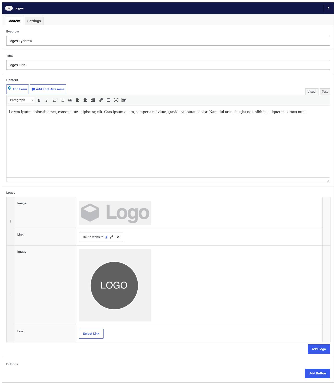
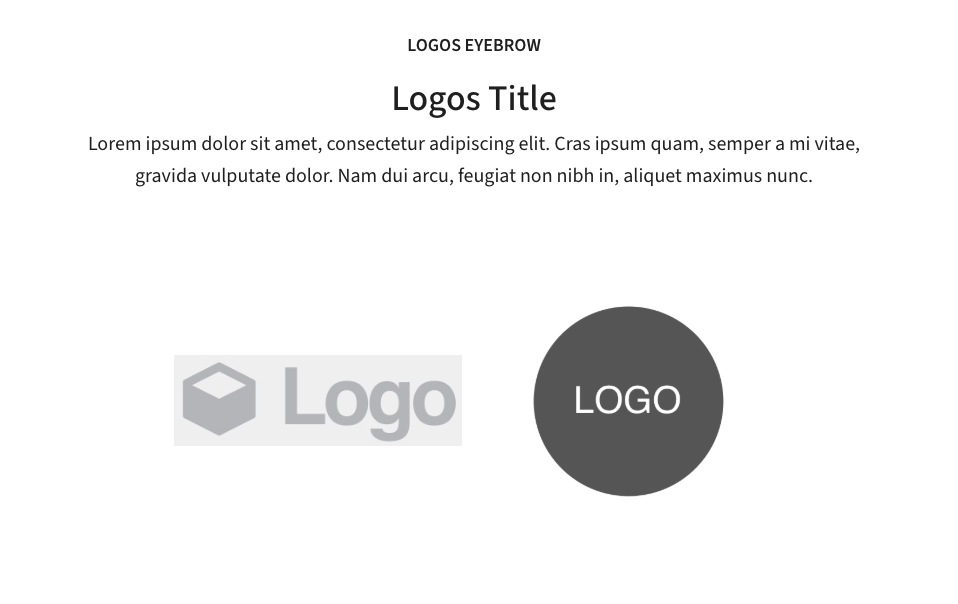
Displays a row of logos, each of which can link to another website. Best for showing partners, sponsors or affiliated organizations.
Content tab
- Eyebrow, Title, Content — optional heading and intro text above the component. The eyebrow is the small line of text above the title.
- Logos — click Add Logo for each logo. Add the Image (a PNG or SVG with a transparent background looks best) and an optional Link to that organization's website.
- Buttons — optional. Click Add Button, then set the link (where it goes and the button text) and an optional icon.
Settings tab
- Hide Component — hides this component from the page without deleting it.
- Logo size — Small, Medium or Large.

Progress Bar
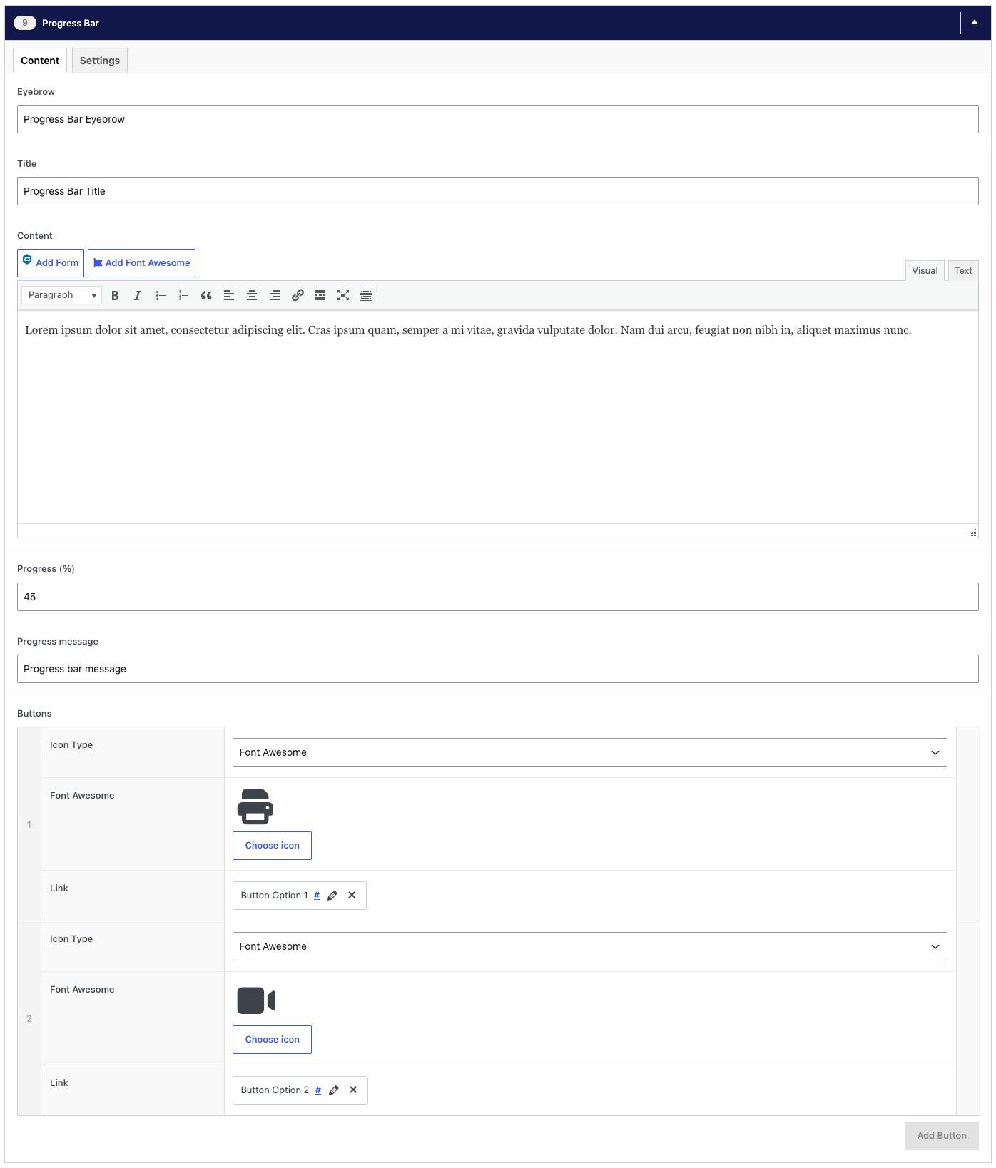
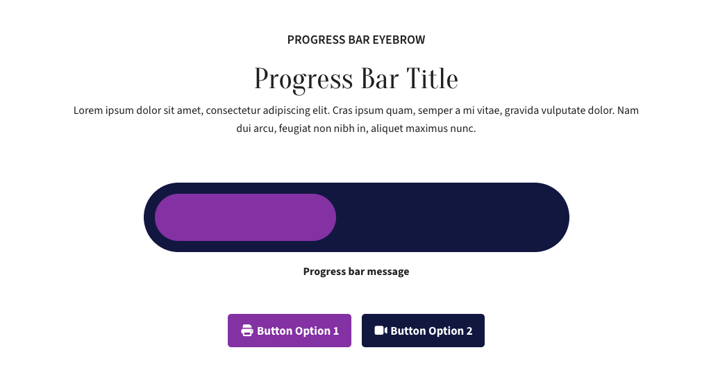
Shows a visual bar filled to a percentage you set, with a short message. Best for fundraising goals or tracking progress on a campaign.
Content tab
- Eyebrow, Title, Content — optional heading and intro text above the component. The eyebrow is the small line of text above the title.
- Progress (%) — a number from 0 to 100 for how full the bar is.
- Progress message — a short line under the bar, e.g. "$12,500 of $25,000 raised".
- Buttons — optional, e.g. a Donate button.
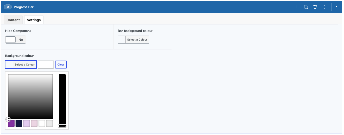
Settings tab
- Hide Component — hides this component from the page without deleting it.
- Bar background colour — the colour of the filled part of the bar.
- Background colour — the background of the whole section. Leave empty for the default.
- Text Colour — choose Light for dark backgrounds and Dark for light ones. Only applies when a background colour is set.
Media
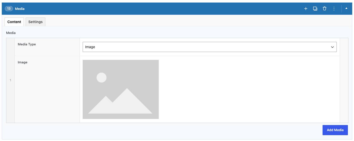
Shows a standalone image, video or embed with no surrounding text. Best for visuals that speak for themselves, like a feature photo or a welcome video.
Content tab
- Media — click Add Media and choose Image (pick from the Media Library) or Video (paste a YouTube or Vimeo link). Add more than one to make a slider.
Settings tab
- Hide Component — hides this component from the page without deleting it.
- Show captions — shows each image's caption underneath it. Captions are added to the image in the Media Library.

Separator
Adds a horizontal divider line. Best for visually separating two sections of a page.
Content tab
- Add Separator — turn on to show the divider line.
Settings tab
- Hide Component — hides this component from the page without deleting it.



Supported Media
The supported media types are as follows:
Images
Standard Formats: .jpg, .jpeg, .png, .gif, .ico
Vector & Special: .svg
Documents & Spreadsheets
Adobe & Text: .pdf, .txt, .psd
Microsoft Word: .doc, .docx
Microsoft Excel: .xls, .xlsx
Microsoft PowerPoint: .ppt, .pptx, .pps, .ppsx
OpenDocument: .odt
Apple: .key (Keynote)
Audio
Standard & Web Audio: .mp3, .m4a, .ogg, .wav, .flac
Video
Video & Subtitles: .mp4, .m4v, .mov, .wmv, .avi, .mpg, .ogv, .3gp, .3g2, .vtt (text captions)
Adding Images
There are two ways images get onto the site:
Directly inside a block — any block with an image field (Hero, Media, Text and Media, Cards, etc.) has a box you click to open the Media Library. Click Upload Files to add a new image from your computer, or pick an existing one already in the library, then click Select.
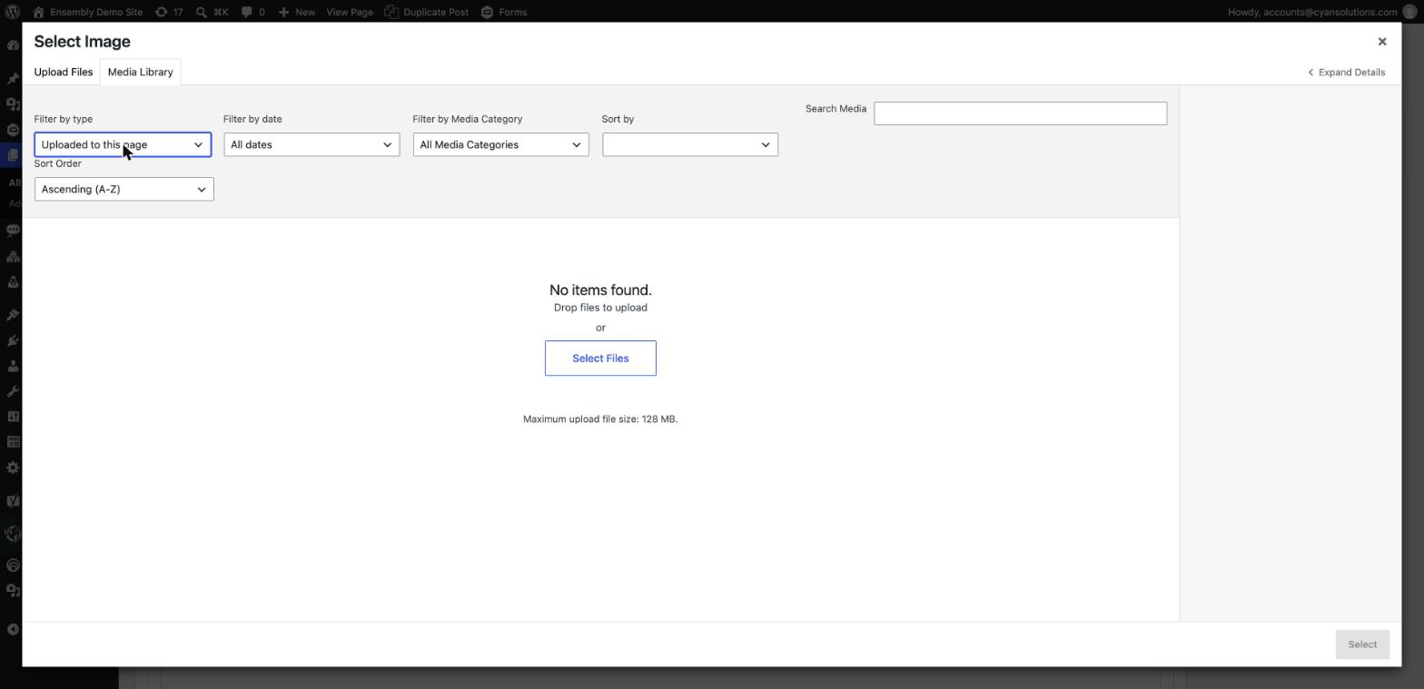
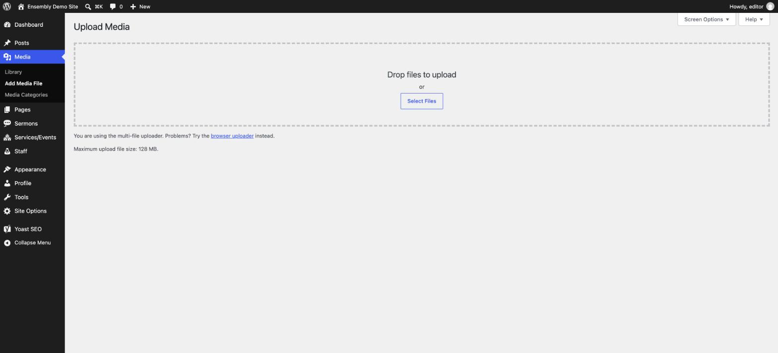
Straight into the Media Library — go to Media → Add New (or drag files onto that screen) to upload images ahead of time, before you've decided which block they'll go in.
A couple of habits worth keeping:
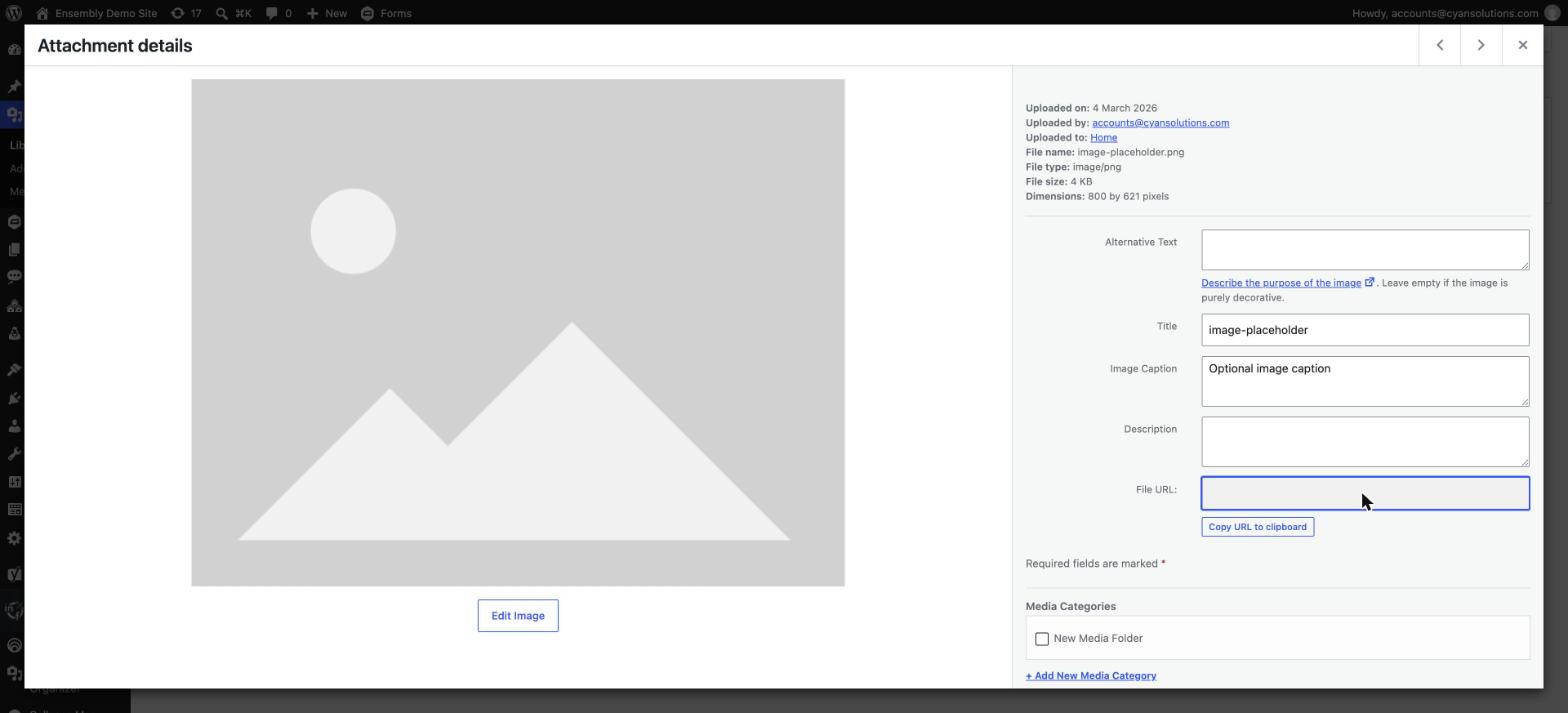
Add Alt Text to every image you upload (click the image in Media → Library to find the field). It's read aloud by screen readers and helps with search engines — a short, plain description of what's in the photo is enough.
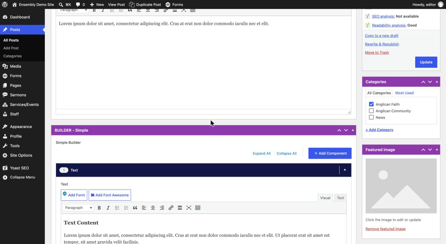
For a Post, Sermon, or Staff profile, the Featured Image (set from the box in the right-hand sidebar of the editor) is what shows up as the thumbnail elsewhere on the site — that's different from an image placed inside the content itself.
Images & Media Tips
Uploaded images are automatically compressed for faster page loads — you don't need to shrink files yourself before uploading, though starting with a reasonably sized file (under a few MB) still helps.
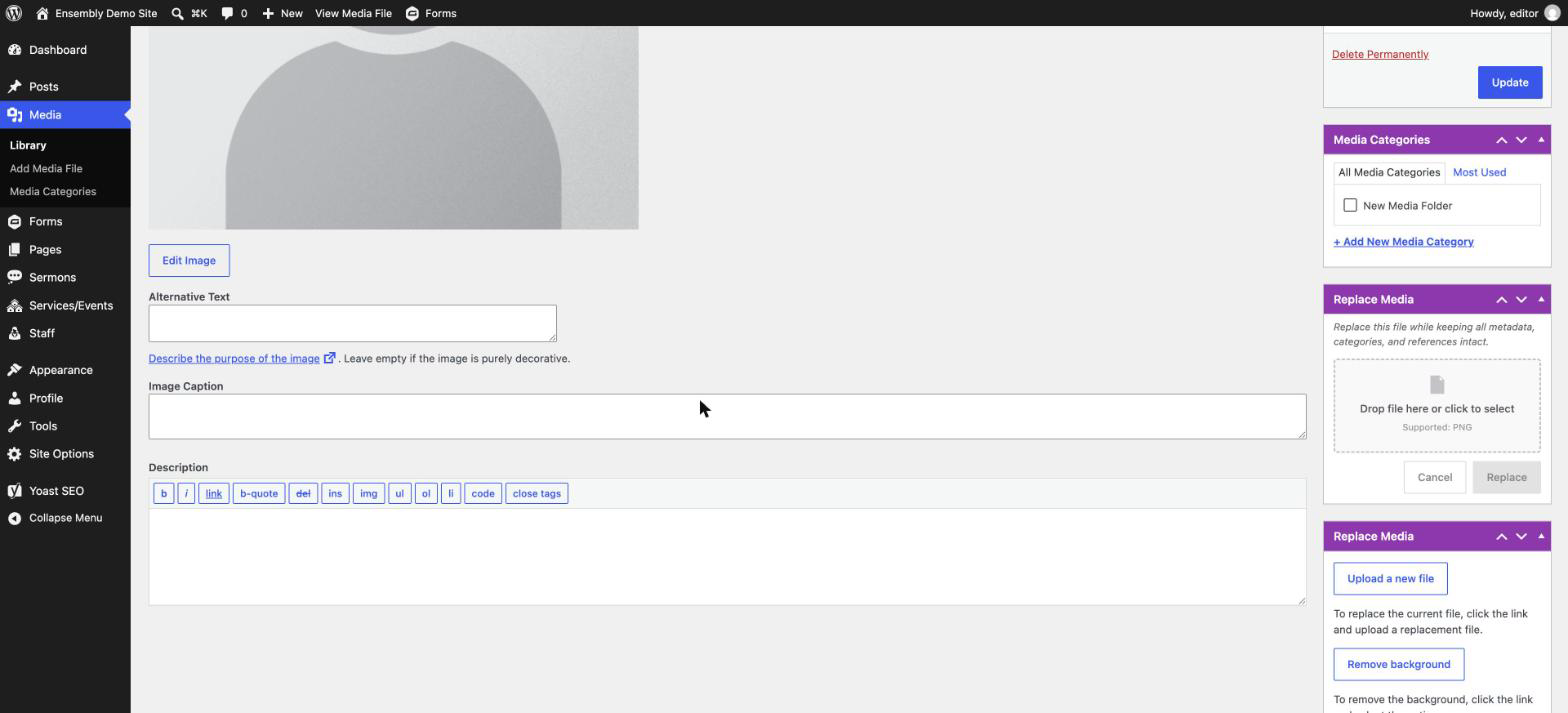
To swap out an image without breaking a link that's already in use elsewhere (e.g. a staff photo used on two pages), use Media → Library, open the image, and look for the Replace Media option rather than deleting and re-uploading.
The Media Library supports folders for organizing uploads — look for the folder view/filter at the top of Media → Library if it's getting hard to find things.
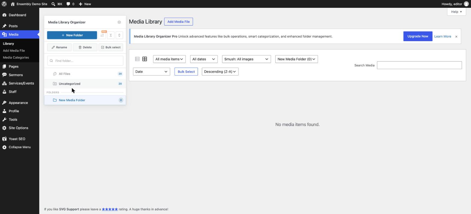
SVG files (simple vector graphics, often used for logos and icons) can be uploaded directly — most WordPress sites block these by default, but this site allows it.
News
Posts are for news/blog articles. Go to Posts → Add New:
Type a Title.

Like pages, there's no open text box — build the article using the Simple Builder blocks (Text, Media, Accordions, Text Columns) via Add Component.
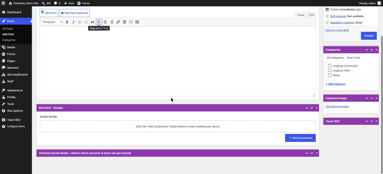
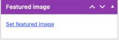
Set a Featured Image using the box in the right-hand sidebar — this is the thumbnail shown wherever the post appears in a News Feed or Cards block elsewhere on the site.
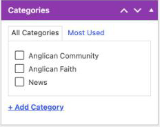
Assign a Category in the sidebar so it shows up correctly in any category-filtered feed.
Click Publish.
Simple Builder
Posts and Sermons use a smaller block set than Pages — add one from Add Component the same way, then pick its type.
| Block | What it shows | Use it for | Key fields |
|---|---|---|---|
| Text | A block of rich text | General paragraphs, announcements, the bulk of an article | Just a text editor |
| Media | A standalone image, video, or embed | Standalone visuals that don't need surrounding text | Image or video items; captions on/off |
| Accordions | Expandable, click-to-open sections | FAQs, policies, anything with many short topics | Eyebrow, Title, Content; each item: a label and its content |
| Text Columns | Text split across 2+ columns | Longer text that benefits from a multi-column layout | Per column: icon, content, buttons; number of columns, background/text colour |
Text
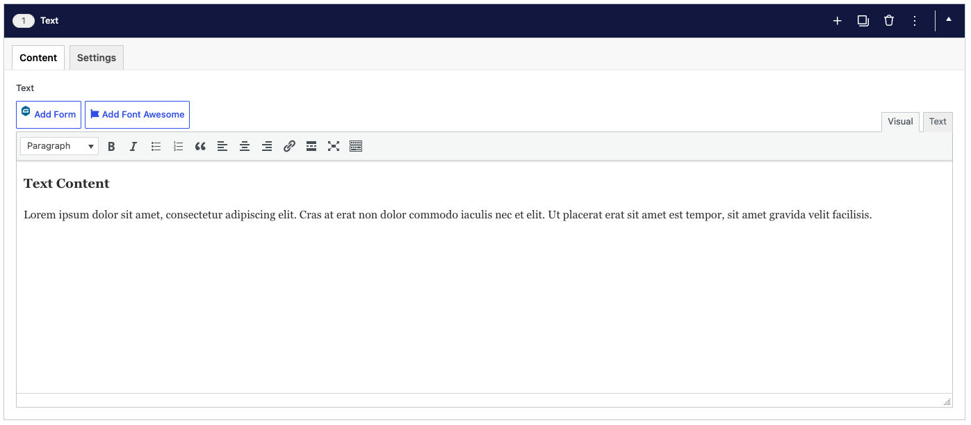
A block of rich text with the usual formatting tools (headings, bold, lists, links). Best for general paragraphs, announcements and the bulk of an article.
Content tab
- Text — a standard text editor. Use the toolbar for headings, bold, lists and links, and the Add Form / Add Font Awesome buttons to insert a form or an icon.
Settings tab
- Hide Component — hides this component from the page without deleting it.


Media
Shows a standalone image, video or embed with no surrounding text. Best for a photo or video that supports the article, such as event photos or a recorded message.
Content tab
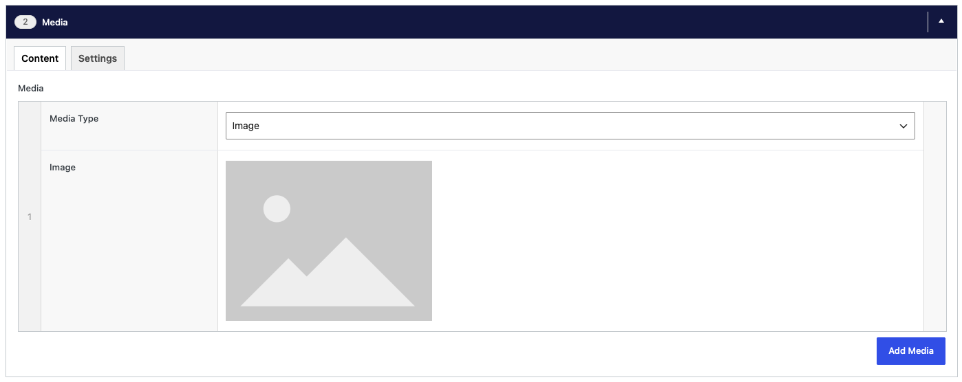
- Media — click Add Media and choose Image (pick from the Media Library) or Video (paste a YouTube or Vimeo link). Add more than one to make a slider.
Settings tab
- Hide Component — hides this component from the page without deleting it.
- Show captions — shows each image's caption underneath it. Captions are added to the image in the Media Library.

Accordions
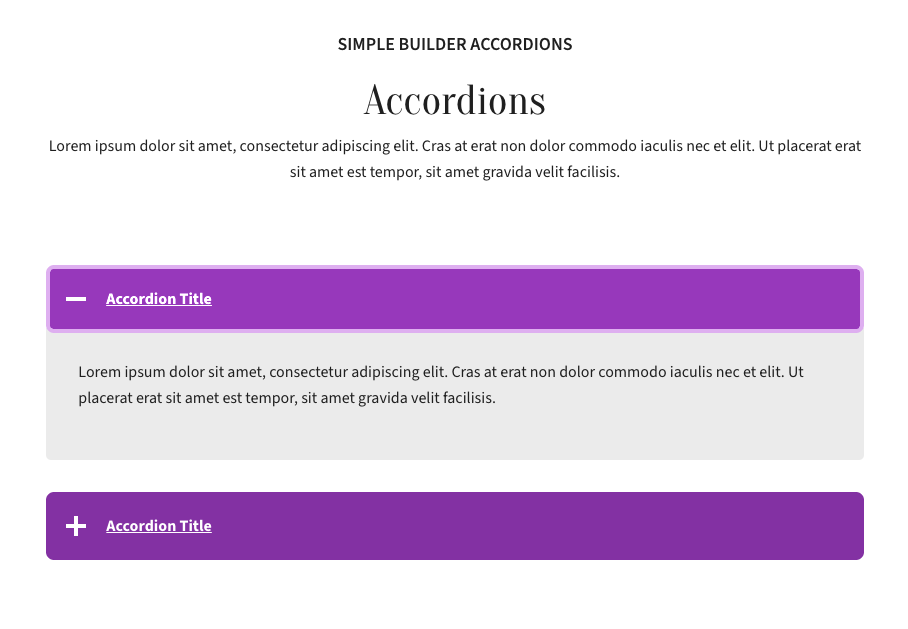
A list of headings that each open to reveal their content when clicked. Best for FAQs, policies or any post with many short topics, so readers can jump to what they need.
Content tab
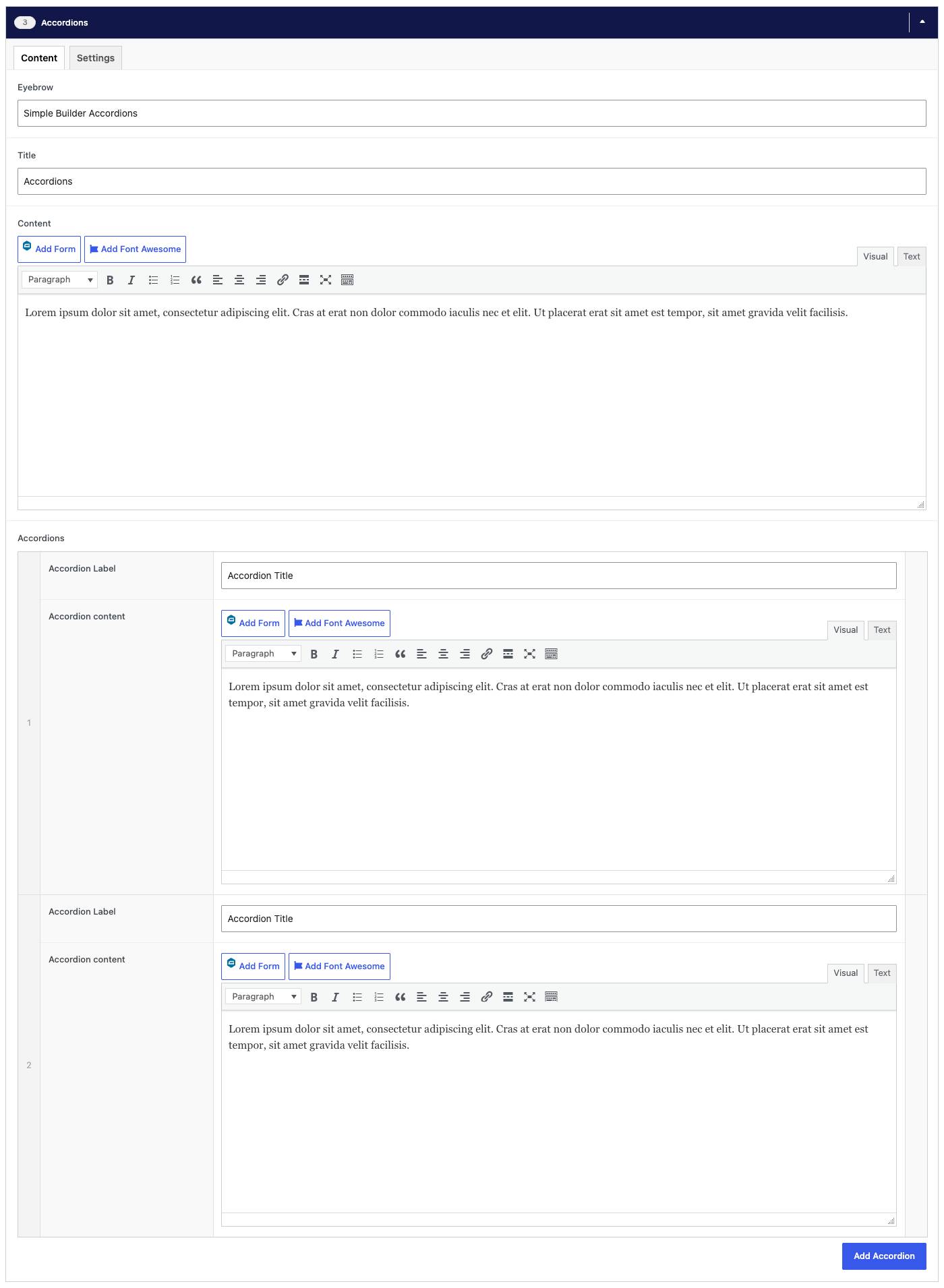
- Eyebrow, Title, Content — optional heading and intro text above the component. The eyebrow is the small line of text above the title.
- Accordions — click Add Accordion for each item. The Accordion Label is the heading readers click, and the Accordion content is what opens up below it.
Settings tab
- Hide Component — hides this component from the page without deleting it.

Text Columns
Splits text across two or more side-by-side columns, each with an optional icon and buttons. Best for longer text that reads more easily in columns, or a few related points next to each other.
Content tab
- Columns — click Add column for each column. Each has an optional icon (pick one from the icon library, or upload your own image) and its own content.
Settings tab
- Hide Component — hides this component from the page without deleting it.
- Number of columns — how many columns sit side by side (1–3).
- Background colour — leave empty for the default, or pick a colour.
- Text Colour — choose Light for dark backgrounds and Dark for light ones. Only applies when a background colour is set.
Sermons
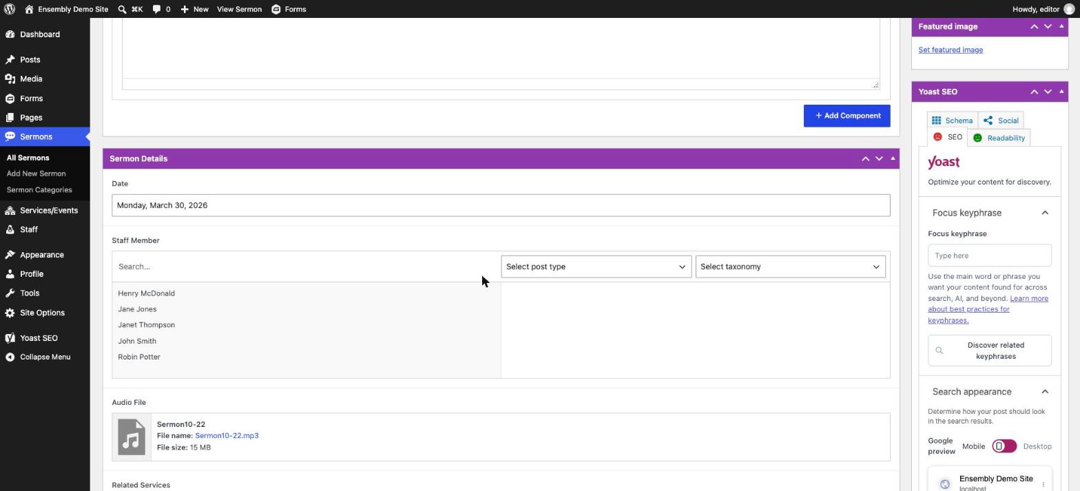
To add a sermon: go to Sermons → Add New and fill in:
Date — when it was preached
Staff Member — the speaker, pulled from the Staff directory
Audio File — upload the recording
Related Services — link it to the service/event it was part of
Description — a short summary or the sermon text
Sermons can be grouped into categories (e.g. by series) — use Sermons → Categories to manage those. Categories are what the "Select a Category" option in the Cards and News Feed blocks filters by, so tagging sermons consistently keeps those auto-pulled feeds accurate elsewhere on the site.
Services & Events
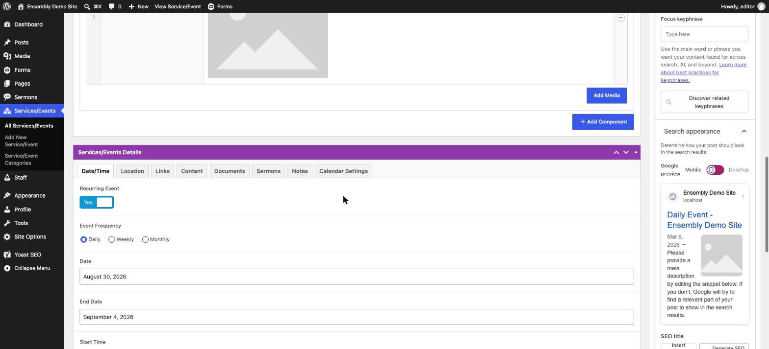
Go to Services → Add New to create a service or event. Key fields:
Recurring Event — toggle on for weekly/regular services; set the Event Frequency alongside it
Date, End Date, Start Time, End Time
Location and Map Link — the map link accepts a Google Maps address
Description — the main write-up shown on the event's page
Buttons — e.g. a "Register" or "Learn more" link
Documents — attach any related PDFs (bulletins, forms)
Select Sermon — link to a related sermon, if one exists
Exclude from Calendar — turn this on if the event shouldn't appear on the public calendar (e.g. an internal-only listing)
Services and events can also be grouped into categories under Services → Categories, which feed the category filters in Cards/Hero blocks elsewhere on the site.
Staff
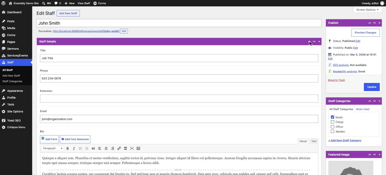
Go to Staff → Add New to add a team member. Fields are straightforward: Title, Phone, Extension, Email, and a Bio. Add a featured photo the same way you would on a page (the image box in the right-hand sidebar of the editor).
Staff can be grouped by category (e.g. Clergy, Office, Wardens) under Staff → Categories — this controls how they're grouped when a Staff block pulls from a specific category rather than showing everyone.
Creating/Editing Forms
Forms on this site are built with Gravity Forms. To create a new one:
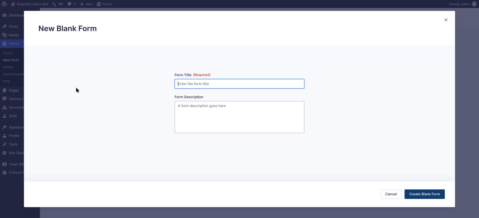
Go to Forms → New Form, give it a name (and optional description), and click Create Form.
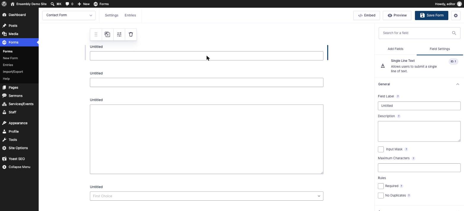
You'll land in the form editor. Drag fields from the panel on the right (Name, Email, Phone, Address, Paragraph Text, etc. under Standard Fields; more complex options like File Upload or Multi-Page under Advanced Fields) onto the form on the left.
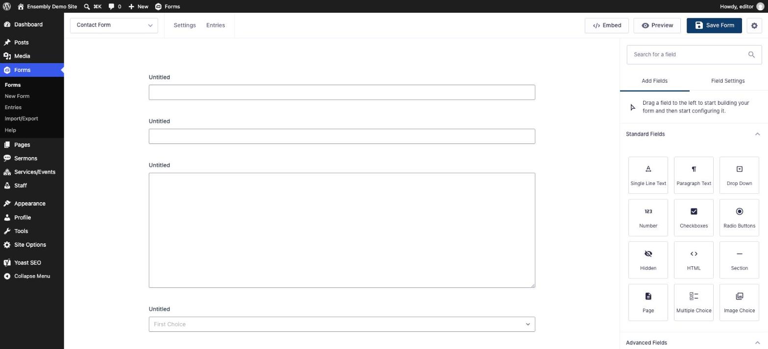
Click any field to open its settings — this is where you set its Label, mark it Required, add placeholder text, or adjust size.
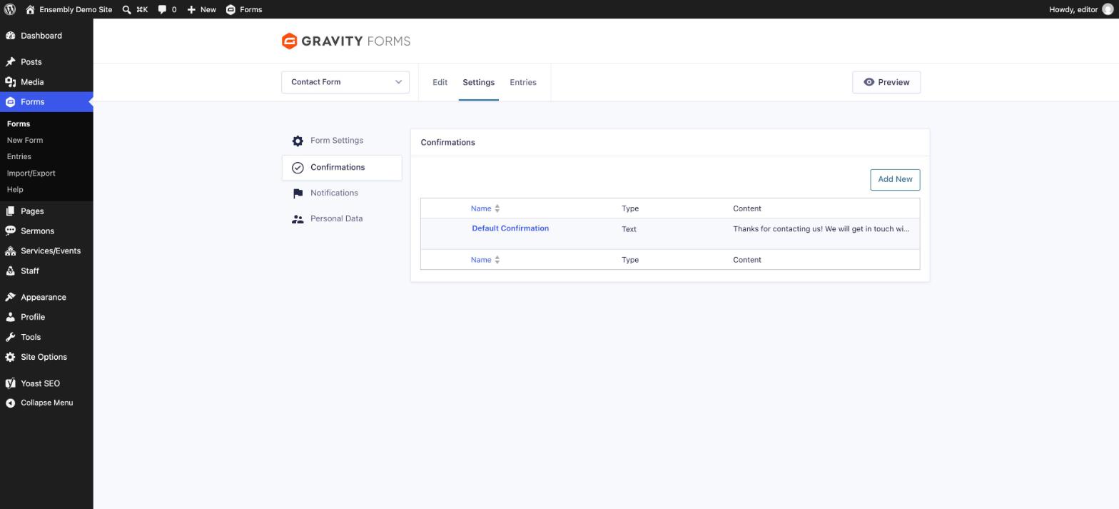
Under the form's Settings → Confirmations, set what a visitor sees right after submitting (a thank-you message, or a redirect to another page).
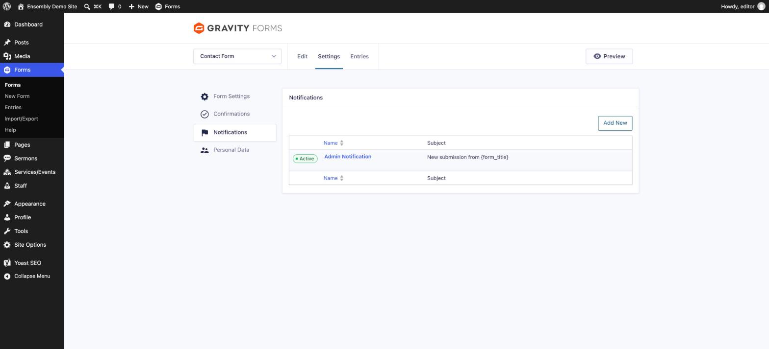
Under Settings → Notifications, set who receives an email when the form is submitted, and customize that email's subject/content if needed.
Click Save (top right) when done.

To edit an existing form, go to Forms, hover over the form's name, and click Edit.
Once a form exists, add it to a page using the Form block in the Page Builder (see above) — see the next section for how to check who has submitted it.
Form Entries & Notifications
Forms on the site (contact forms, sign-ups) are built with the Gravity Forms plugin. To view or edit a form's fields, go to Forms in the left menu and select it.
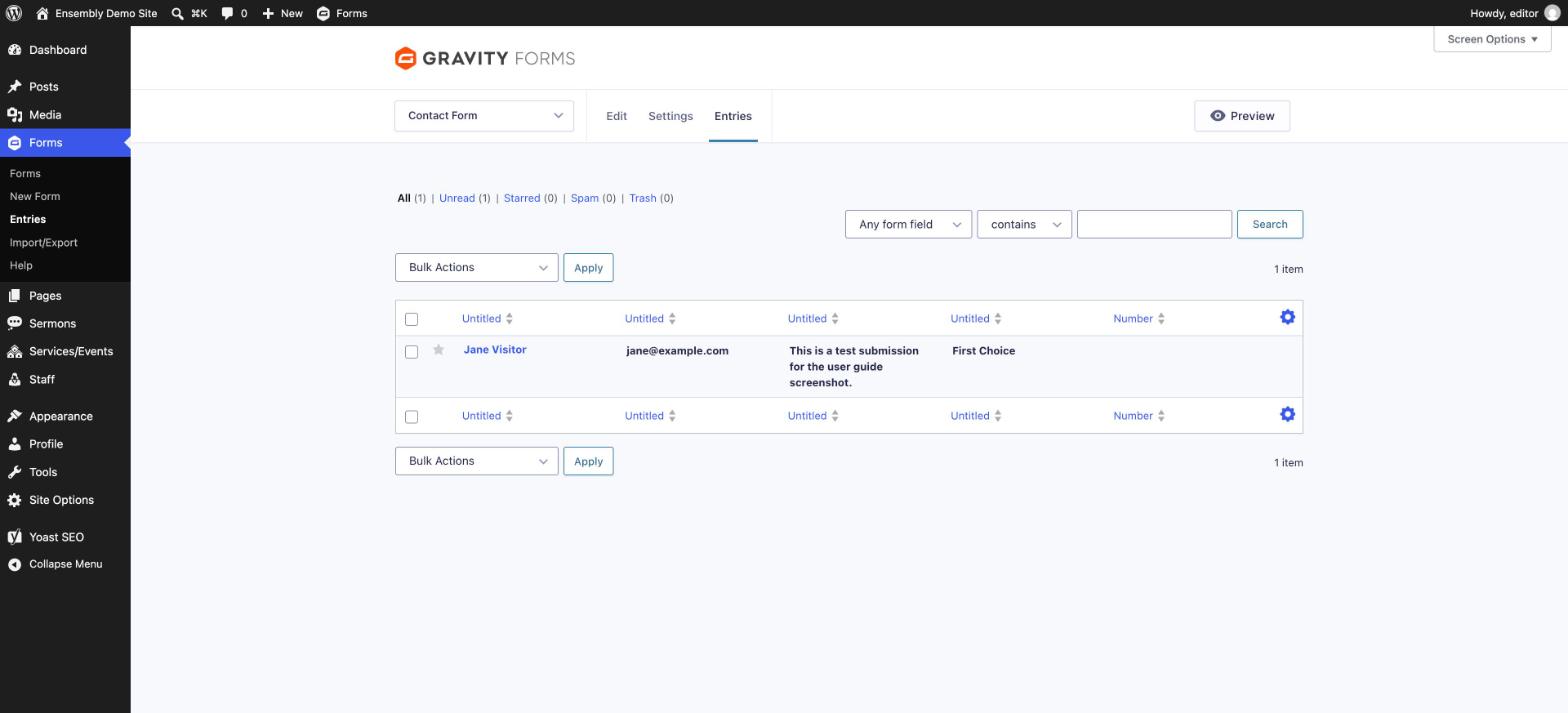
To see who has submitted a form, go to Forms → [form name] → Entries. Submissions are stored there and typically also emailed to a configured address — check Forms → [form name] → Settings → Notifications to see or change who receives those emails.
To place a form on a page, use the Form block in the Page Builder and select the form from the dropdown.
Menu
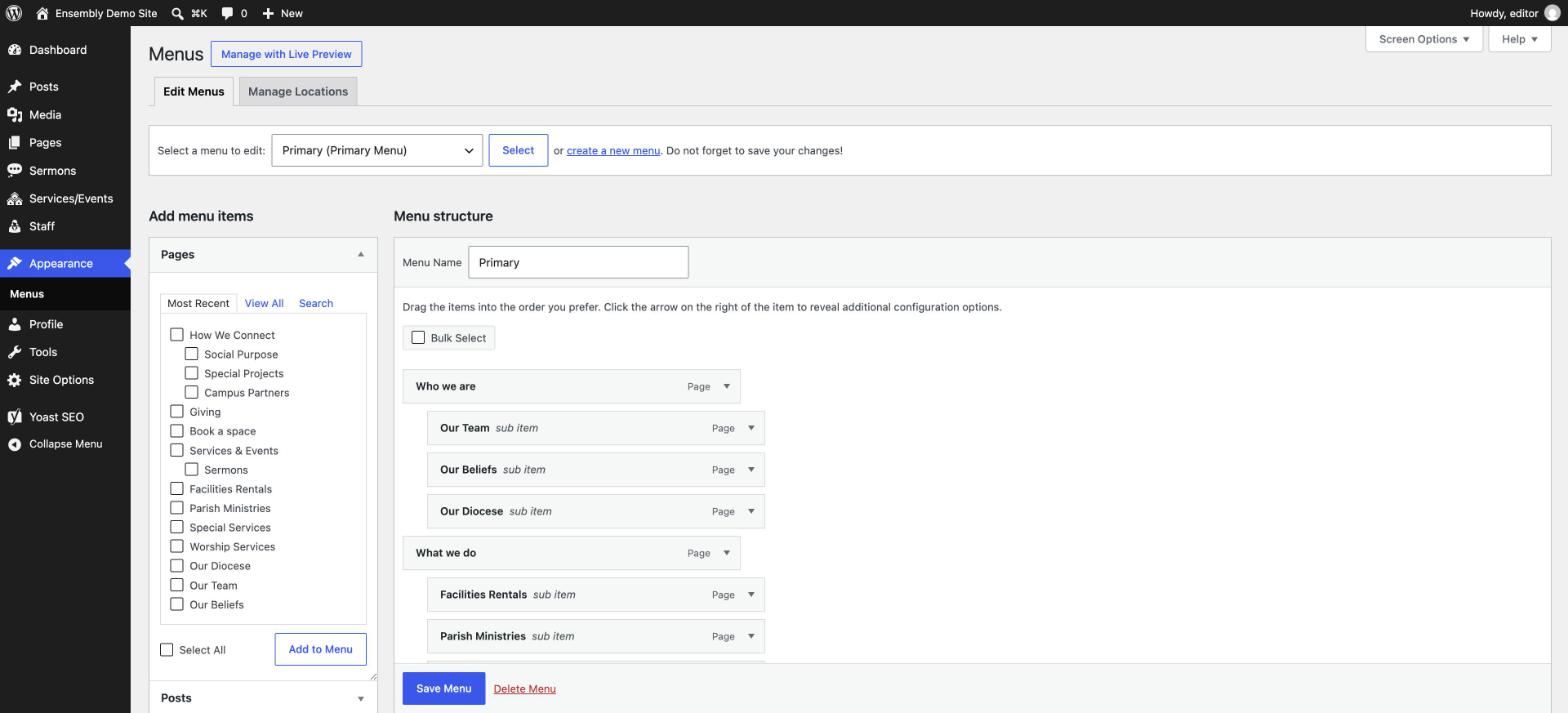
Go to Appearance → Menus.
Use the dropdown at the top to pick which menu you're editing (the main header navigation is called Primary Menu).

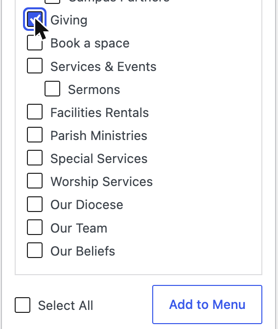
To add an item: find the page/post in the panel on the left, check its box, and click Add to Menu. It appears at the bottom of the menu structure on the right.
To reorder items, drag them up or down in the right-hand panel.
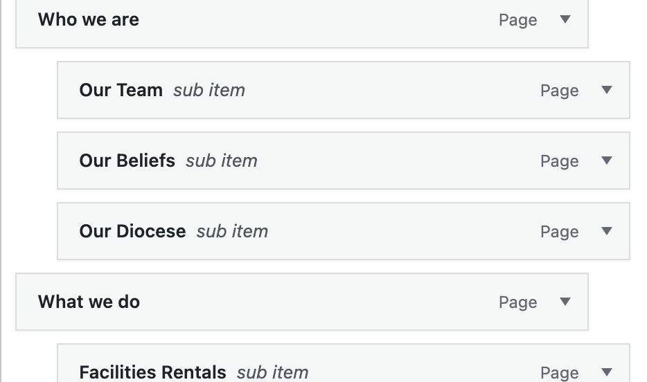
To make an item a dropdown under another, drag it slightly to the right so it nests underneath its parent item.
To change the label shown in the menu without renaming the actual page, click the small arrow on the menu item to expand it and edit Navigation Label.
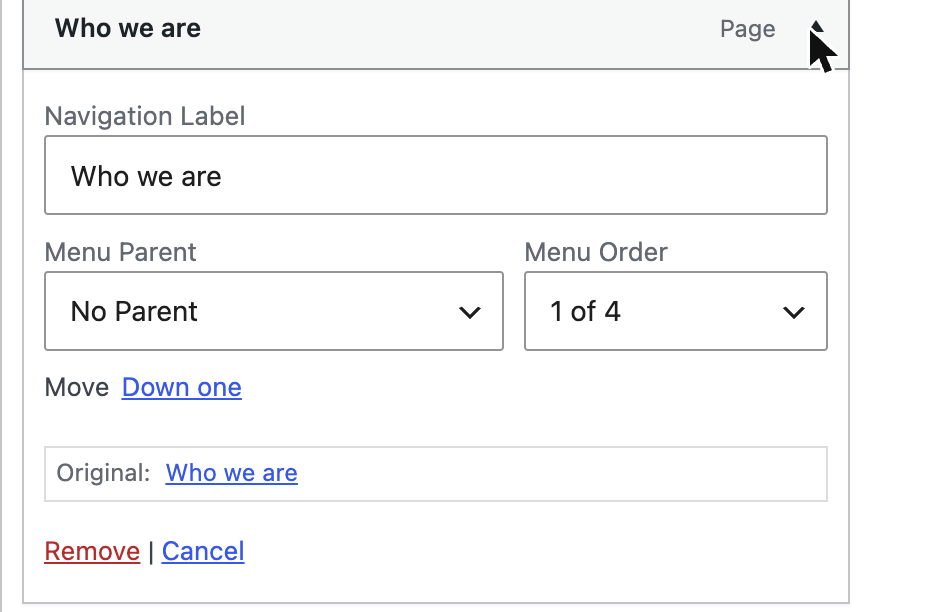
Click Save Menu when done.

This site has a few menu locations (Primary, Utility, Language) — most day-to-day editing happens on the Primary Menu, which is what visitors see across the top of every page.
SEO Basics
The Yoast SEO plugin adds a panel at the bottom of every page/post editor. The two fields worth setting on each page:
SEO title — what shows as the clickable headline in Google search results
Meta description — the short summary shown under that headline
Yoast also scores your content (green/yellow/red) against general SEO best practices — it's a helpful guideline, not a requirement, so don't feel obligated to chase a perfect green score on every page.
Getting Help
Before reaching out, it's worth checking:
Did you click Update after making the change?
Is the change visible after a hard refresh (Ctrl/Cmd + Shift + R) — your browser may be showing a cached version of the page.
Does the issue happen on the live site, or only while you're editing?
If it's still not working, or you need something this guide doesn't cover (a new page type, a design change, a plugin issue), contact Cyan Solutions with the page URL and a short description of what you expected vs. what happened — a screenshot helps.